

The Ultimate Guide to the perfect SaaS pricing page (incl. real examples)
+ free review of your pricing page


Hey - it’s Alex, this time together with pricing expert Rob Litterst!
Rob is the co-founder of PricingSaaS, where they help SaaS leaders nail pricing and packaging.
Over the previous issues, we have already covered other important SaaS pages:
✅ How to create high-converting SaaS homepages
✅ SaaS homepage copywriting guide
✅ The perfect product pages for SaaS founders
👉 This guide might be too long for your email inbox; read it instead online here.
Today, we’ll break down exactly how to create a great SaaS Pricing Page:
1️⃣ The must-have and nice-to-have section of great pricing pages
2️⃣ How can you optimize each section
3️⃣ Examples you can steal from.
+ a free bonus: Rob & I will review your pricing page for free. More about it at the end of the episode 😀
In case you missed the last 3 episodes:
✅ How to create powerful SaaS lead magnets
✅ Get your first Investment Guide
✅ The perfect product pages for your SaaS
A quick word from our sponsors
📢 Topo – The AI SDR agent that monitors your market 24/7

Most founders & sales teams spend more time finding who to contact than actually selling.
Topo’s new free version gives you 3 qualified leads every day, each with a reason to reach out, based on real buying signals.
If you’re in B2B sales, try it. You’ll instantly get why Topo’s approach works.
📢 Taplio - The all-in-one LinkedIn platform to turn content into pipeline
👉 Reach 25.000+ SaaS operators with sponsored content. Sponsor the next newsletter.
4 Must-Have Sections for your pricing page
Your pricing page is one of the most important pages on your website. For many visitors,
✅ It’s where interest converts to action, or
❌ Where confusion sends them to a competitor.
Here’s the thing: people visiting your pricing page aren’t starting from zero.
They’ve likely seen dozens, if not hundreds, of SaaS pricing pages before. They’ve compared your competitors. They know what information they’re looking for and where they expect to find it.
(Please remind yourself of the different stages of awareness.)
This context is actually good news. It means you don’t need to reinvent the wheel.
The best pricing pages aren’t the most creative – they’re the clearest.
They meet visitor expectations while providing enough context to help someone confidently choose the right plan.
Patrick Campbell, Founder of ProfitWell and pricing legend, used to say that visitors should be able to decide which plan is right for them within 30 seconds.
That’s the benchmark. If it takes longer, you’re probably overcomplicating things.
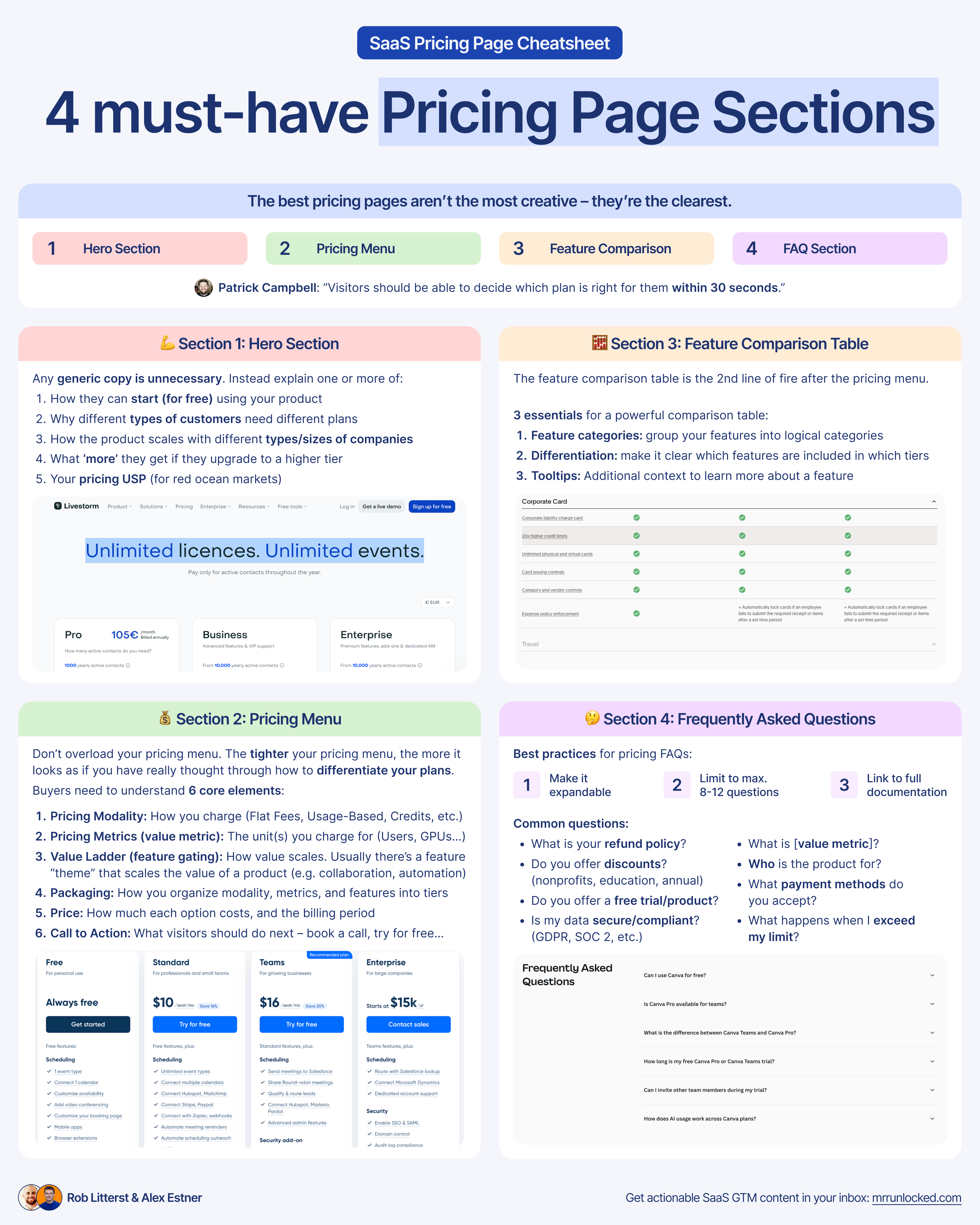
This guide breaks down the four essential sections every SaaS pricing page needs:
1️⃣ Hero,
2️⃣ Pricing Menu,
3️⃣ Feature Comparison Table,
4️⃣ FAQ.
We’ll walk through what each section must include, common mistakes to avoid, examples from companies doing it well, and optional sections to consider.
The goal isn’t to create the flashiest pricing page. It’s to create one that clearly communicates value, eliminates confusion, and helps visitors take the next step, whether that’s signing up for a free plan or scheduling a demo.
Let’s dive in.
Section 1: Hero Section
The Hero section of the pricing page is what you see at the very top when you visit. It’s important to remember that the hero section on a pricing page isn’t the hero section on your homepage.
The pricing page is typically more of a down-funnel visit. Meaning it is primarily for someone closer to the consideration/purchasing stage, rather than a first-time visitor who is just learning about your company.
Because of this, your pricing page does not need to be created for a first-time visitor.
❌ You don’t need to give them a ton of information up at the top of the page.
❌ You don’t need to tell them what your product does.
They probably already know that, and have a lot of context around it. Any generic copy related to your company is unnecessary.
So instead, use the section to explain one or more of:
1️⃣ How can they start (for free) using your product
2️⃣ Why different types of customers might want different plans
3️⃣ How the product scales with them (being used by different types/sizes of companies)
4️⃣ What ‘more’ they get if they upgrade to a higher tier
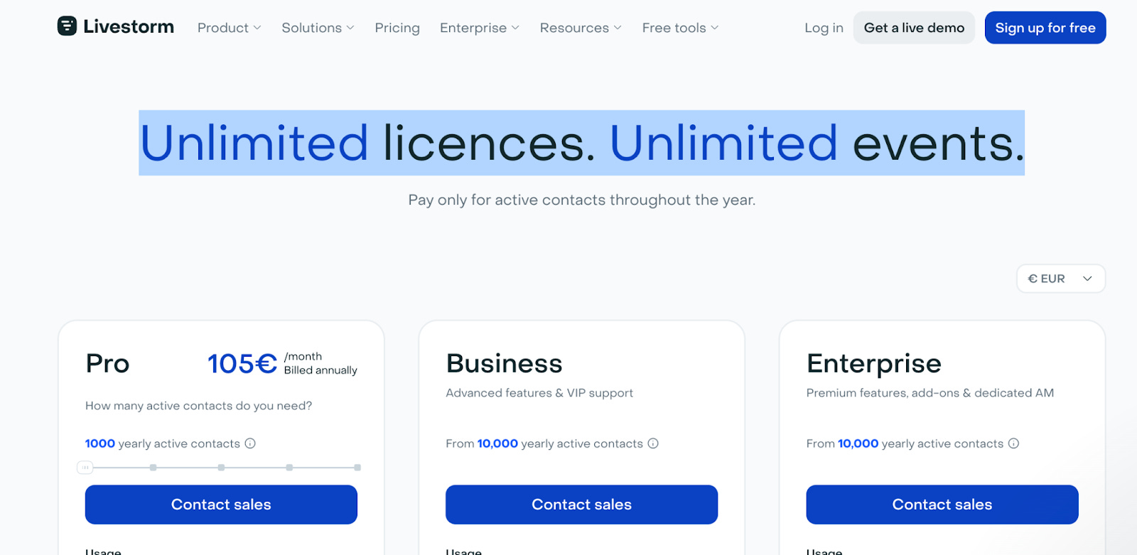
5️⃣ Emphasizing USP in your pricing (for red ocean markets) → See livestorm example
That would make good value-add copy on your pricing page.
A good example here is Linear.

They don’t do anything fancy with the header, just Pricing.
Then, with the subheader, they provide context on how visitors can get started and why they might want to upgrade. This tells visitors a few things.
1️⃣ Linear offers a free plan.
2️⃣ Issues as a metric is important to how pricing scales.
3️⃣ Plans are differentiated by features.
Visitors can now dig into their pricing menu with those details in mind.
Another great way to use your pricing page hero is to communicate that you don’t limit specific actions, especially if you operate in a crowded market where your competitors limit product usage.
A great example is Livestorm. They highlight “Unlimited licences. Unlimited events.”
It’s a great way to communicate how your pricing is different from your (direct) competitors.
We also like how Clarify uses its Hero section. Highlighting that you don’t pay for seats, instead for ‘outcome’.

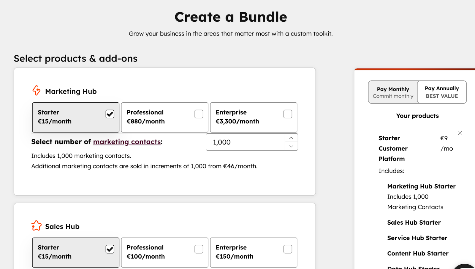
Section 2: Pricing Menu
The Pricing Menu is the most important section of a pricing page.
The goal of the Pricing Menu should be to communicate truly essential information to visitors and to give them as much context as possible to determine how they can work with you.
We see a lot of companies overload the Pricing Menu with exhaustive details, and feel strongly that’s a mistake. One of the counterintuitive things about pricing pages is that
“The tighter your pricing menu, the more it looks as if you have really thought through how to differentiate your plans.”
✅ The goal of the pricing menu should be to show people the key levers and the key differentiators between plans that might determine which one they’re a fit for.
❌ The goal should not be to provide an exhaustive feature list that shows every single differentiator and forces visitors to compare a bunch of numbers.
They can get that in the feature table. If you’re going to create a feature comparison table anyway, then including all that information at the top is redundant.
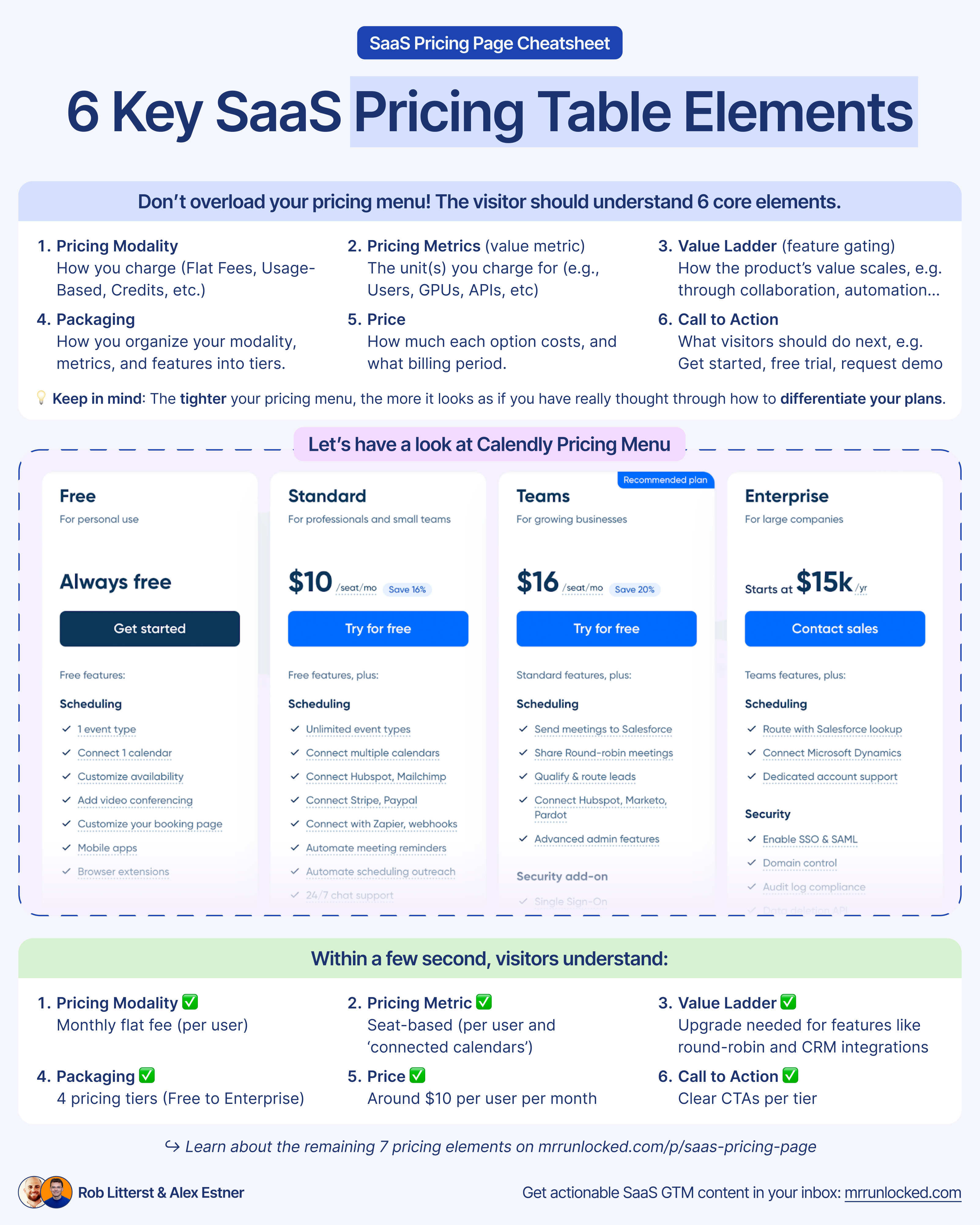
6 Must-have pricing menu elements
From the pricing menu, a visitor should be able to understand 6 core elements:
1️⃣ Pricing Modality
→ How you charge.
Options include Flat Fees (e.g. 50€/month), Licenses (e.g. 50€/month/user), Usage-Based (e.g. 0,1€ per contact), Credits (e.g. 100€ for 1000 credits), or a combination.
2️⃣ Pricing Metrics (aka. value metric)
→ The unit(s) you charge for (e.g., Users, GPUs, APIs, etc).
P.S. Learn how to choose the right value metric for your SaaS.
3️⃣ Value Ladder (aka. feature gating)
→ How value scales (e.g., collaboration, automation, governance, etc).
Usually, there’s a feature “theme” that scales the value of a product. Popular options are collaboration, automation, or sophistication. Make that clear in the pricing menu.
4️⃣ Packaging
→ How you organize your modality, metrics, and features into bundles, usually as discrete tiers. Although some companies don’t do this, they opt for ‘pay as you go’ or à la carte packaging.
5️⃣ Price
→ How much each option costs, and the billing period.
6️⃣ Call to Action
→ What visitors should do next. Usually, either get started, free trial, request a demo, or contact sales.
The concepts above probably sound more complicated than they actually are. Ultimately, in the pricing menu, you want to help a visitor quickly understand how your pricing strategy works and how much it will cost them.
The goal is to help them understand both those things in less than a minute, preferably 30 seconds. If you can do this without doing anything fancy, by all means do it – the simpler the better.
Going back to Linear, they communicate all of this extremely efficiently.
And also, Calendly does a pretty good job.
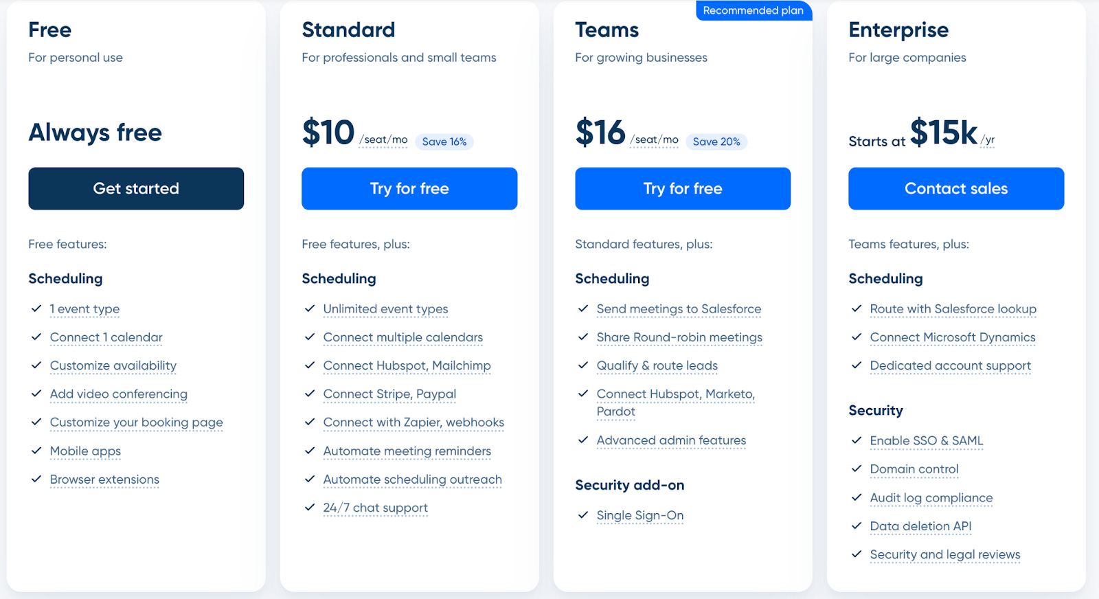
Within a few seconds, visitors understand:
✅ Pricing Modality = monthly flat fee (per user)
✅ Pricing Metric = seat-based (per user) and ‘connected calendars’
✅ Value Ladder = We need to upgrade for more ‘team features’ like ‘round robin’ and ‘CRM integrations’
✅ Packaging = 4 pricing tiers (from Free to Enterprise)
✅ Price = around $10 per user per month
✅ CTA = Clear CTAs per tier
It becomes clear that ‘number of event types’ and ‘connected calendars’ are key value metrics. And if you need more team features like ‘round robin’ and ‘CRM integrations’, you need to upgrade
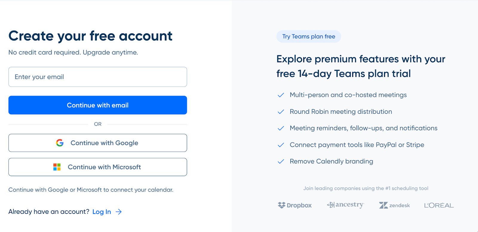
(even though we think that Calendly can be more specific about their 14-day free trial for team accounts)
You only get the info on the 14-day trial once you click on the CTA.
5 Pricing Menu Recommendations
Here’s a list of recommendations to organize your pricing menu’s core elements:
1️⃣ Recommendation 1: Keep your Plan Name simple
People love to obsess over plan names. We don’t think this makes a difference. Keep it straightforward. But this is just something that people are used to seeing first, so start there. Common terminology you see a lot is:
Free
Basic
Starter
Standard
Pro
Premium
Plus
Teams
Business
Enterprise
2️⃣ Recommendation 2: Put the monthly cost of your price
Under the plan name, you want to put the monthly cost (also for the yearly plans) and make sure that you’re pinning that monthly cost to whatever your pricing metric is.

3️⃣ Recommendation 3: Include the billing period(s)
You want to make sure that with the price, you’re including the billing period and how that works. A common way to do this is a toggle up above the pricing grid.
4️⃣ Recommendation 4: Highlight Key Features and Usage Thresholds
Once you have the plan name, the price, and the billing period, you want to make sure that for each plan, you are highlighting the core features and usage thresholds that come with each plan. The key here is to keep it concise. Try to stick to 5 variables, only more if really needed. Include only the usage metrics that are really important to drive price, and any features that are critical for plan differentiation.
5️⃣ Recommendation 5: Add specific CTAs
The only other thing that is an absolute must is a call-to-action. You want to have a button for each tier guiding what a visitor should do next.
If it’s a free plan or you lean more PLG, it’s likely “Get Started.”
If you lean more sales-led, it could be “Request a Demo” or “Contact Sales.”
Importantly, each plan can have a different CTA depending on how it fits into your GTM motion.
Those are really the core elements of a pricing menu. Beyond that, everything else is nice to have. If you can communicate everything you need to across those variables, do it. You don’t want to make your pricing page more complicated than it has to be.
7 Nice to have pricing menu elements
There are, of course, other interesting things that you can add to the pricing menu if it makes sense.
Below are a few examples of “nice to have” additions that can help visitors understand the essential information as well.
#1 “Best for” Statement
A “best for” statement tells visitors which plan is best for whom, so it’s easier for them to decide what tier is best for them. Again, ideally, visitors can figure that out quickly on their own without being told, but if not, a “best for” statement can help. Figma does a really good job of this, as shown below:
#2 Used by
You can add social proof in your pricing table by adding companies using this price plan.
Livestorm does this
#3 Key Features
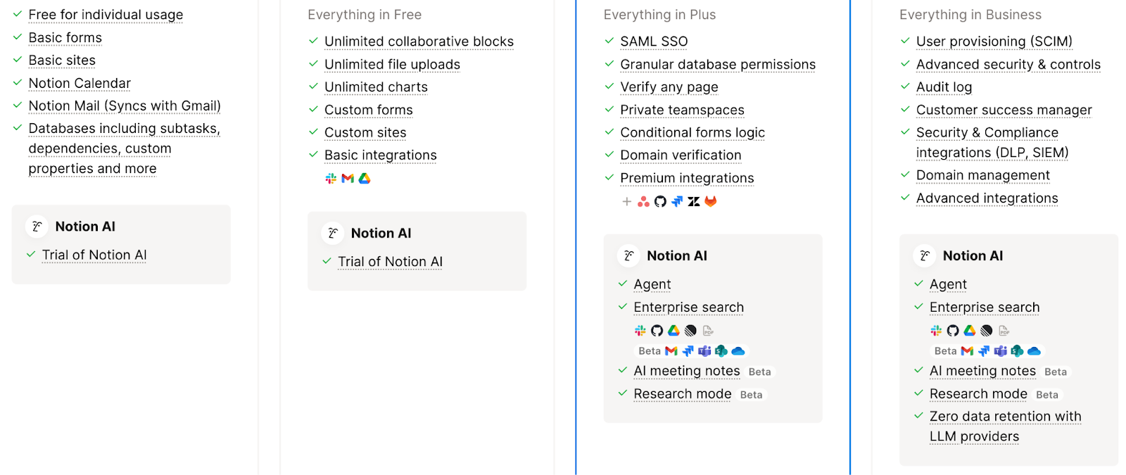
You can go even deeper with feature emphasis, highlighting specific features that are important to your product, and how different plans allow customers to access those features. An example would be what Notion does with Notion AI. Below the key features section, there’s an additional section dedicated to Notion AI, highlighting what each plan gets within that feature category.
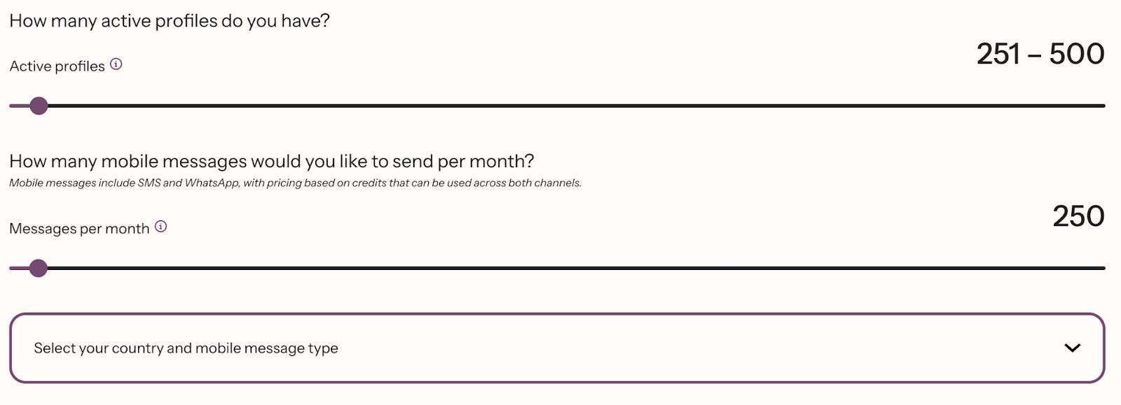
#4 Pricing Calculator
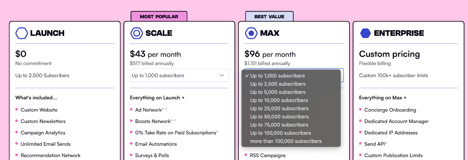
Many SaaS companies don’t have a flat license fee for all users, and need to allow visitors to customize pricing based on their own needs. A popular way to do this is with a slider. Ideally, the price points for each plan will dynamically change as you slide up and down.
Klaviyo is a great example here. They essentially offer 3 options: a free plan, an Email plan, and an Email + SMS plan. The price of the paid plans is dictated by database size, message volume, and geography, all of which are front and center on their pricing page:
Another option is “in-plan” customization, like beehiiv. They have a dropdown with different contact volumes under the Scale and Max plan to help visitors decide between the two.
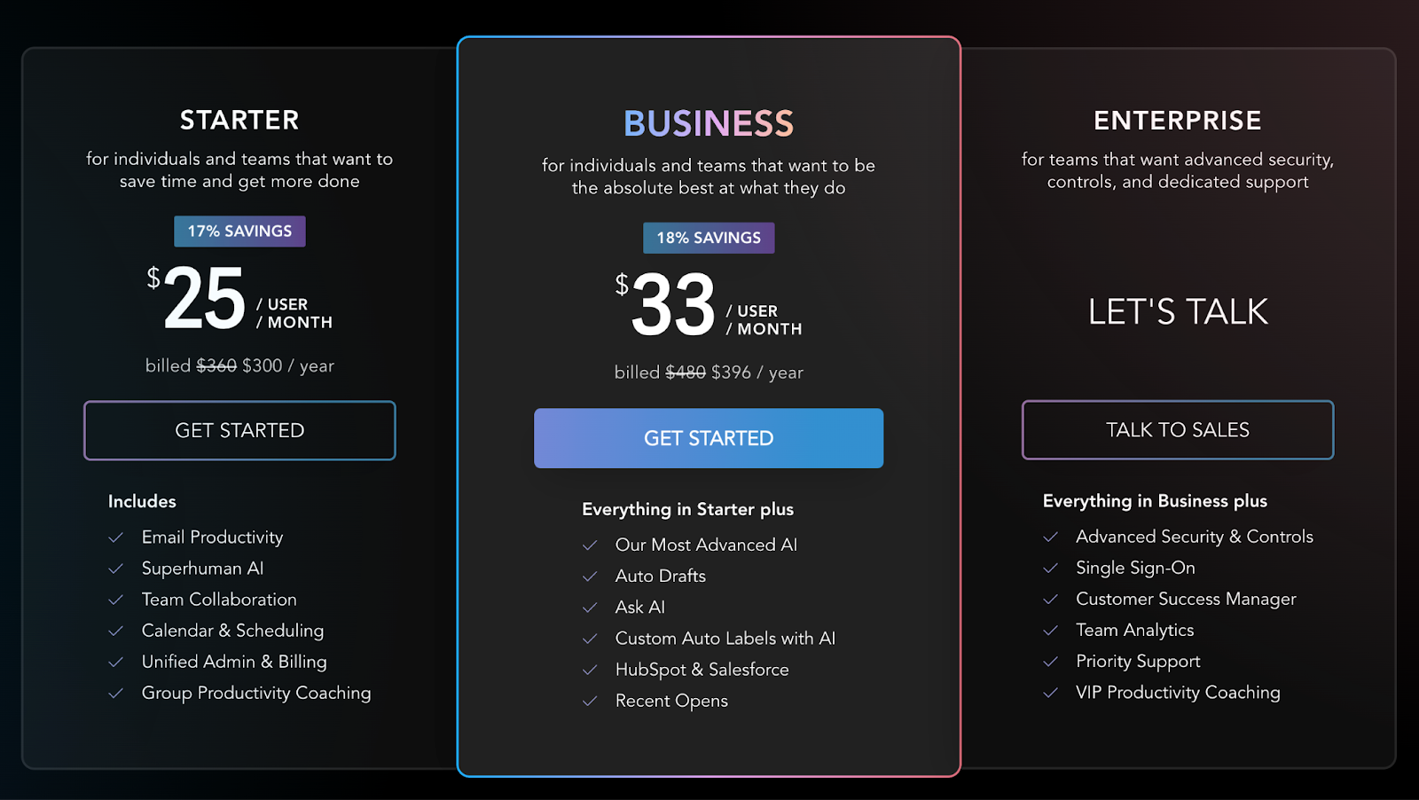
#5 Visual Differentiation
Visual design elements can be used to push visitors to a specific tier. You’re likely familiar with the strategy to highlight a “Recommended” or “Most Popular” tier.
Superhuman’s approach doesn’t use any words, but brings the Business plan to the forefront:
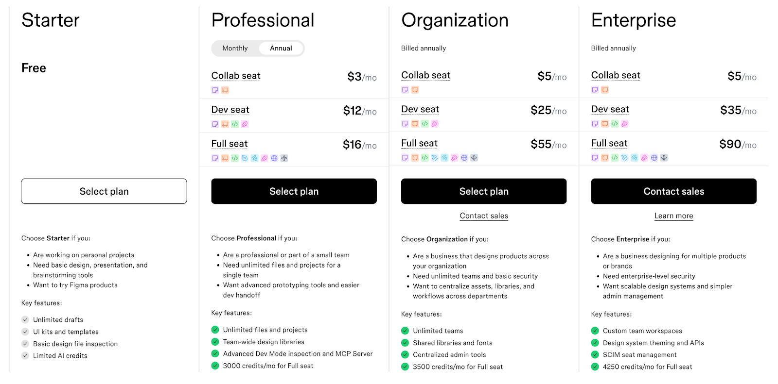
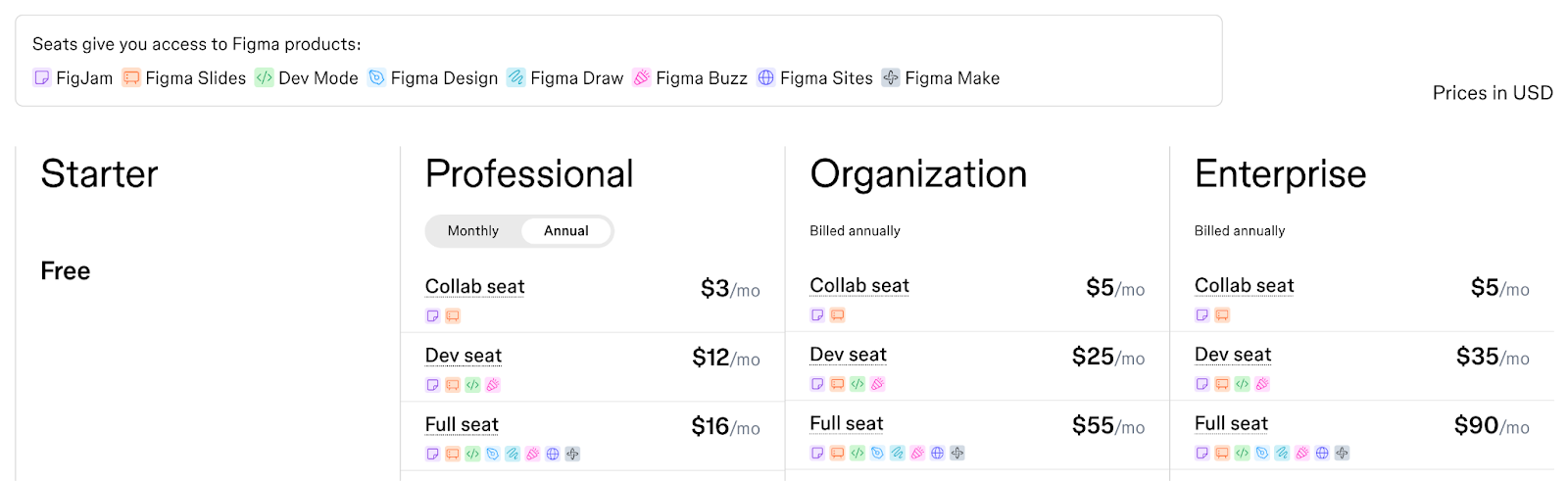
One of the more creative examples of visual design is how Figma highlights which products are included in which seat types. They created a legend with an icon for each Figma product, then dropped each icon in the appropriate seat within each plan:
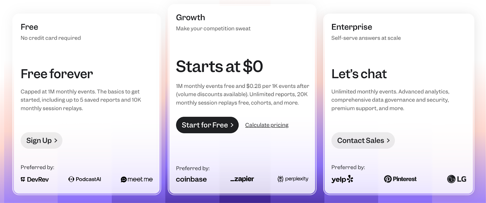
#6 Enterprise Tier
The last nuance of the pricing menu is what to do with the Enterprise plan. The two decisions you need to make are:
Where to show the Enterprise plan.
Whether or not to show price.
We recommend including the Enterprise plan in the pricing menu to keep things simple, and if possible, even show the price.
If you can’t or don’t want to show the full price, at least provide a “starts at” price.
This comes with 2 advantages:
Bringing the Enterprise plan into the main grid makes it easy to compare all plans in one place. And it leaves the real estate outside the pricing menu for add-ons and professional services.
By showing a “starts at” price, the price for every other plan immediately looks better by comparison. Classic price anchoring. And if your competitors don’t show Enterprise pricing, you get better optics for being transparent with customers.
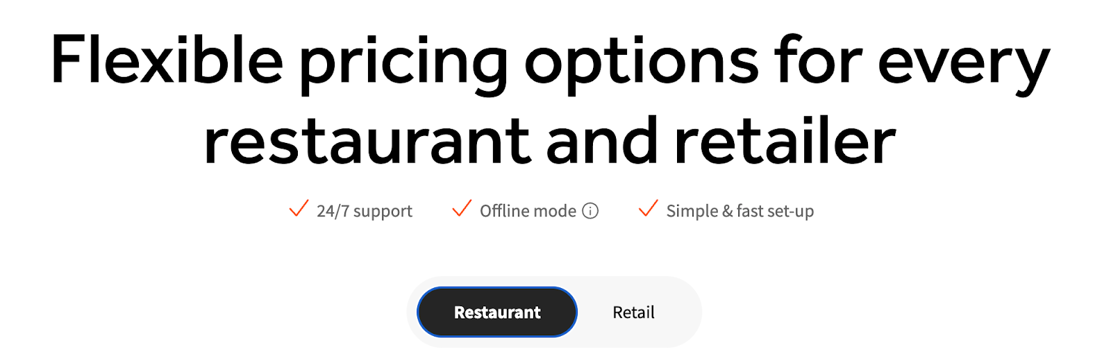
#7 Product Tabs
The very last thing is organizing multiple products. If you have multiple products that visitors can explore, you want to make it very clear how pricing works for each. Most companies will have tabs for each product above the Pricing Menu to make it easy to navigate.
For instance, Toast has a simple toggle for its two core personas: restaurants and retail.
If you have multiple products that can be purchased together, you also may want to highlight bundle opportunities, like HubSpot.
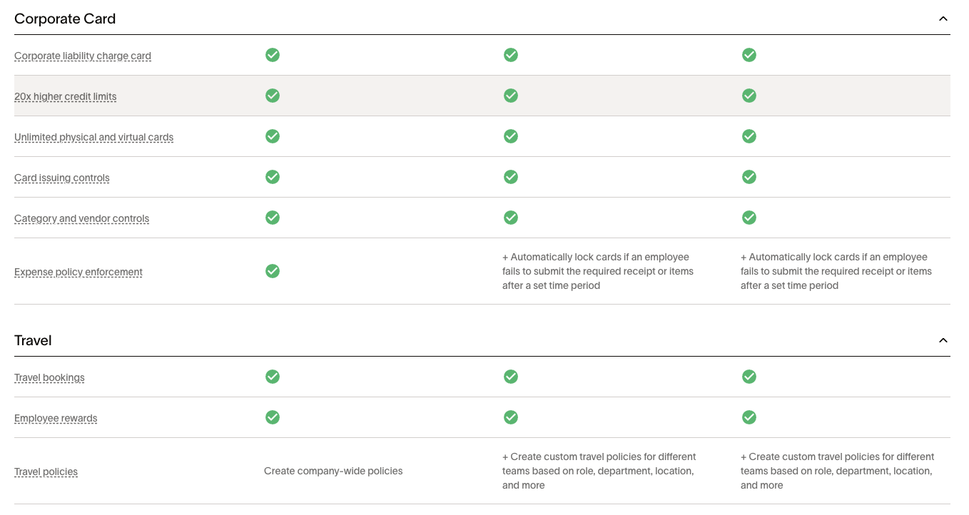
Section 3: Feature Comparison Table
The feature comparison table acts as the second line of fire. The main pricing menu should answer the vast majority of questions that visitors have about your pricing.
If there are answers that they can’t get from the main menu, like specific features or usage limits, that’s what the feature comparison table is for.
The feature comparison table is straightforward, but there are a few essential elements.
4 essential feature comparison table elements
#1 Feature Categories
First and foremost, you want to group your features into logical categories.
This is going to be very product and market-specific.
A good example is Ramp. They break their feature category table into intuitive sections, including Corporate Card, Travel, Expense Management, Accounts Payable, Procurement, Treasury, and Accounting.
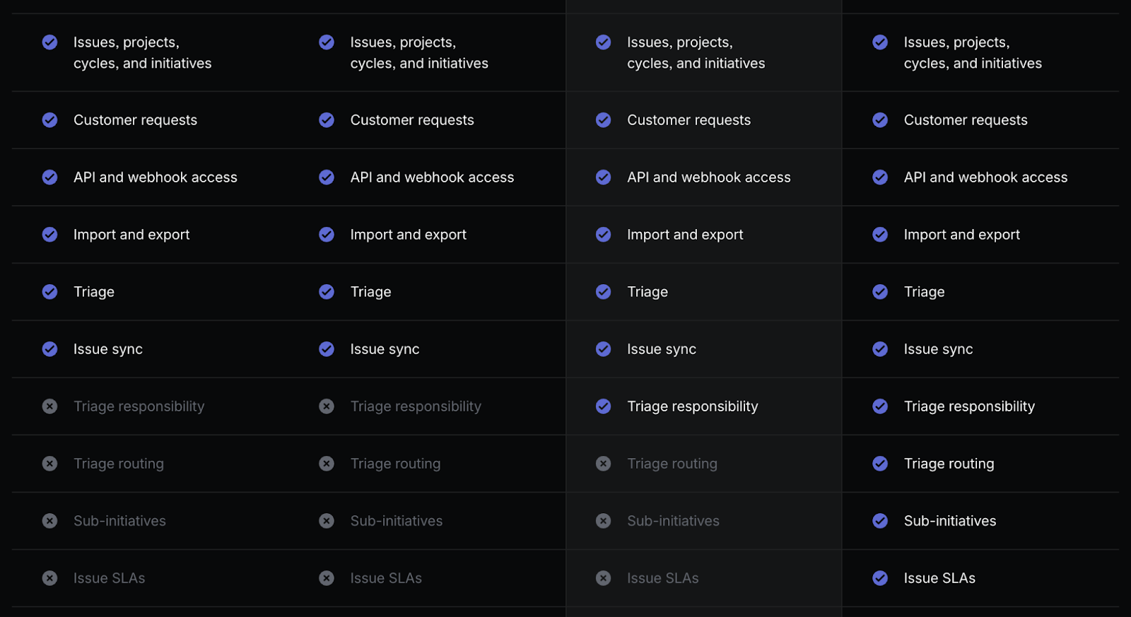
#2 Clear Differentiation
The next step is making it clear which features are included in which tier. Most companies either use checkboxes or X-marks. Linear uses a combination of the two and shading to show which features are included in each plan:
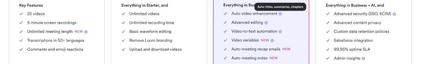
#3 Tooltips
Ideally, it’s easy enough to understand what your features do without additional context, but if you need to provide more context, there are a couple of ways to do this.
Some companies use circular bubbles with an “i” that you can hover over to learn more about a feature.
Others will use a dotted underline under the feature name, and others will use an asterisk.
They all work.
Here’s an example from Loom below, for Auto-video enhancement.
Clear categories, simple differentiation, and tooltips for additional context are all you really need in your feature comparison table.
If you want to take it to the next level and make it particularly visitor-friendly, you can use expandable navigation.
# 4 Expandable Navigation
There are several ways to use expandable navigation. For instance, Asana makes the entire Feature Comparison Table expandable.

Figma makes all feature categories expandable.
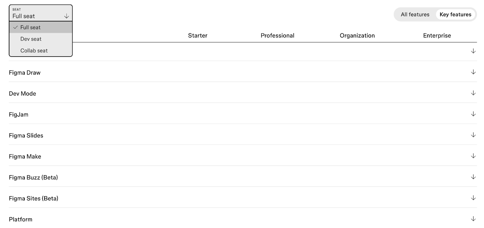
They also allow visitors to view the feature comparison table by seat type, and have a sticky header for plan names.
This allows plan names to remain visible as you scroll, so you don’t get lost wondering which feature is available in which plan.
Section 4: FAQ
The FAQ section should act as your final line of defense before somebody gets in touch with sales. The idea is that 99% of a visitor’s questions can be answered by the time they get through the FAQ section.
As you scroll down the page, you start with the main pricing menu, and most of the questions should be answered.
Then you get to the feature comparison table. Hopefully, any ambiguity around features or usage metrics by plan is answered.
If there’s anything left over that needs to be answered, that’s what the FAQ section is for.
There are a few best practices when it comes to FAQ:
Make it accordion-style/expandable. Otherwise, it will look like a wall of text.
Limit it to 8-12 questions max. If you have more than that, you can probably be clearer in the sections above.
Link to full documentation. Provide links to your help center, knowledge base, or support section if necessary.
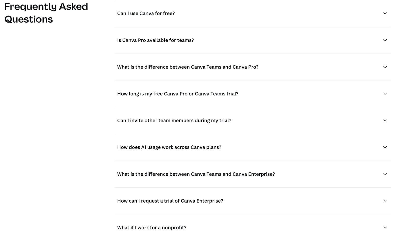
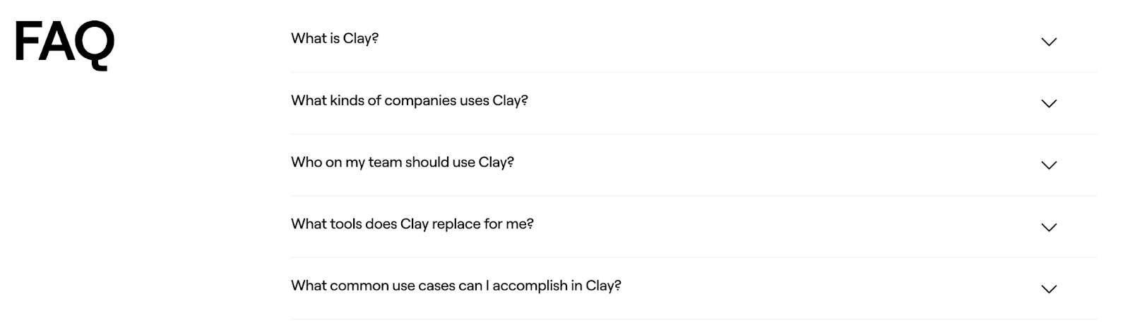
The FAQ section can be industry-specific. However, we will share a few very common questions that you should address as well.
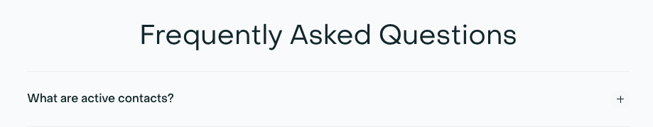
What is “value metric”?
→ Explain in detail how you define your value metric. A good example is Livestorm, they charges based on ‘active contacts’.
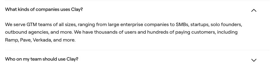
Who is the product for?
→ Re-emphasizing your ideal customers. Clay is doing this quite well.
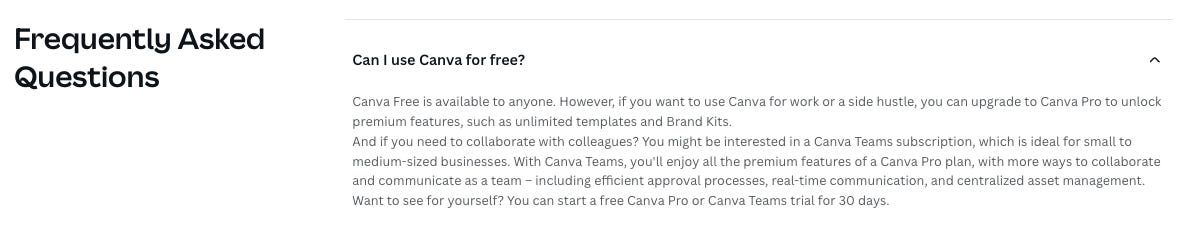
Do you offer a free trial/ free product?
→ In case you do, add it as an FAQ (helps LLM understand your pricing). Canva is a good example
Billing and payment are popular topics across the board. Listing a few of the most common questions that we see below.
What happens when I exceed my limit?
What is your refund policy?
Do you offer discounts? (nonprofits, education, annual)
What payment methods do you accept?
Is my data secure/compliant? (GDPR, SOC 2, etc.)
Clay has a particularly simple FAQ section that provides broader context on their product, customers, users, and use cases.
Optional Sections for your Pricing Page
The sections above are the most important pieces of a pricing page. However, there are many optional sections to consider. Breaking those down below:
# 1 Social Proof
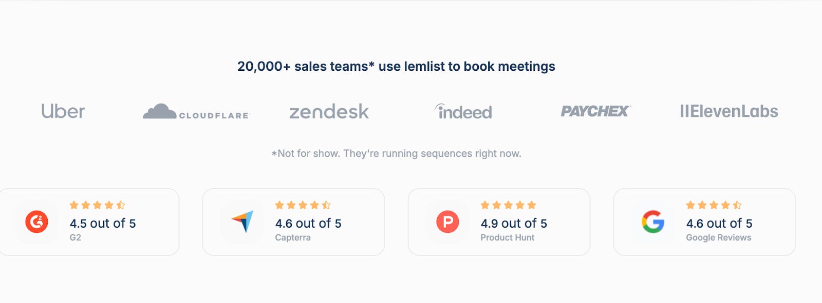
Social proof can take many forms, including a logo wall, customer quotes, testimonials, stats, or G2 or Capterra ratings.
Companies drop social proof all over the place, the 3 most common sections being underneath the Hero section, between the Pricing Menu and the Feature Comparison Table, and between the Feature Comparison Table and the FAQ.
We don’t have a hard opinion about it, but in the interest of communicating essential information as quickly and clearly as possible, we would recommend moving the social proof under the Pricing Menu (and not in the Hero).
Adding relevant logos can be especially powerful for strengthening your positioning. For instance, if you’re positioning your product as a solution for innovative companies, and OpenAI is a customer, that’s great social proof.
Another good one is Mixpanel, which shows customers by tier:
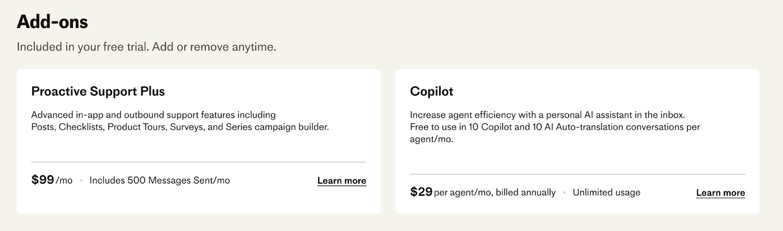
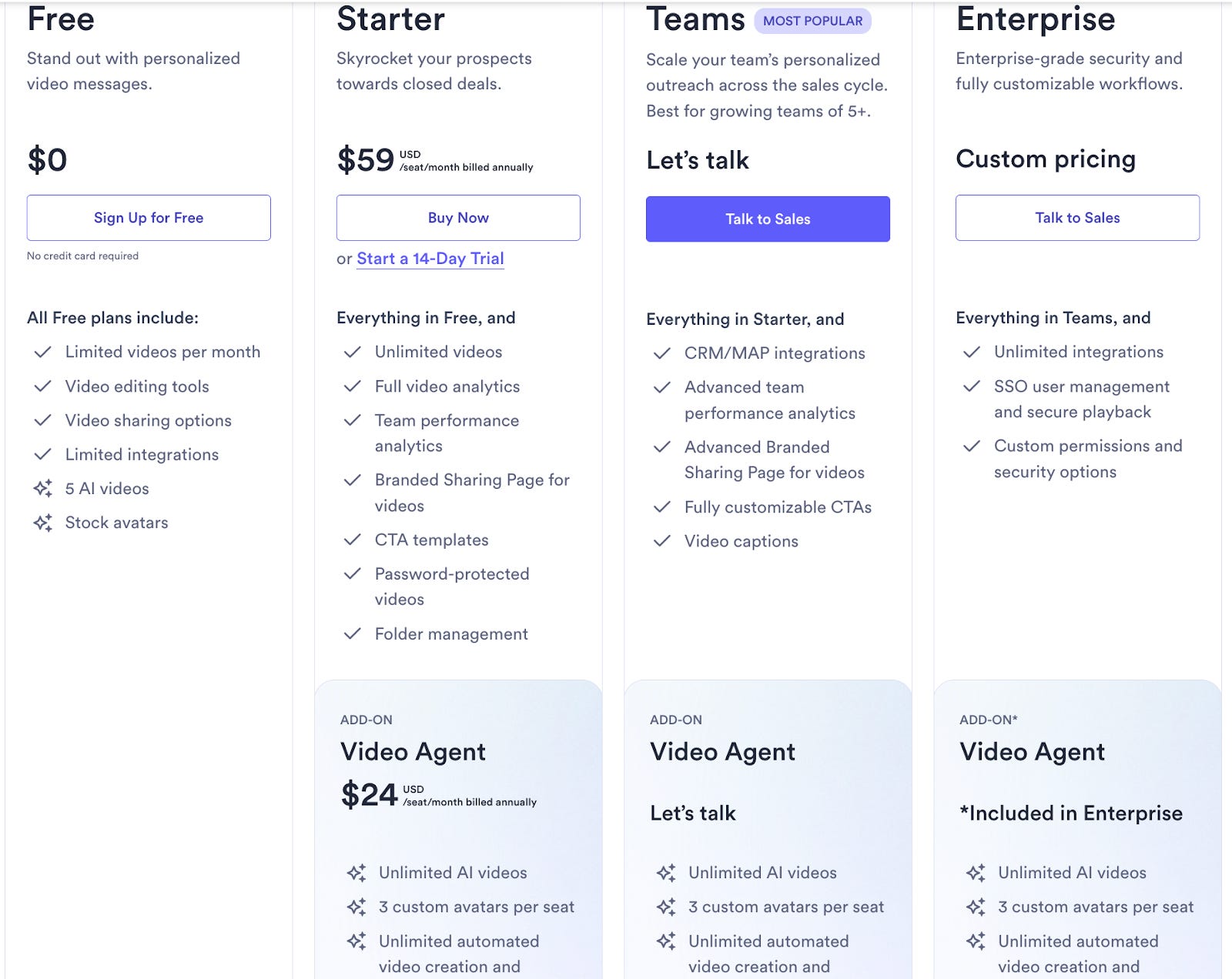
#2 Add-ons and Professional Services
There are two ways to approach add-ons and professional services:
Provide all information on the pricing page.
List the Add-Ons and Professional Services and link to another page.
Intercom does a great job of adding its add-ons to the pricing page.
Another example is Vidyard, who add its add-on directly on the pricing table.
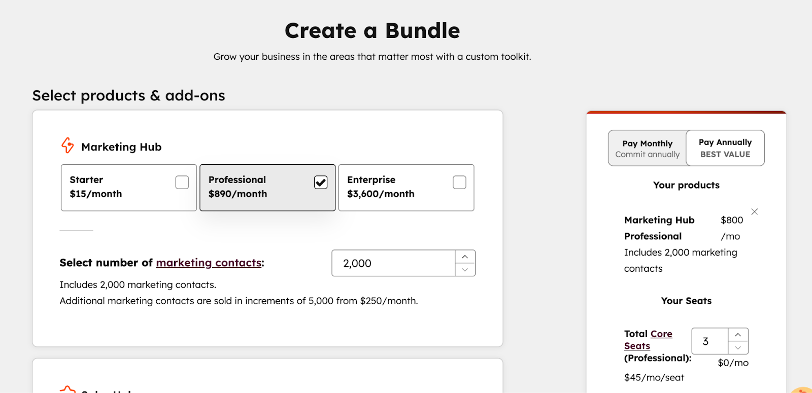
#3 Pricing Calculator
We discussed the slider earlier, but a pricing calculator can be helpful if you have multiple products, multi-year contract terms, and other variables that influence the final price point. HubSpot is a great example: they link to the pricing calculator directly from the pricing page.
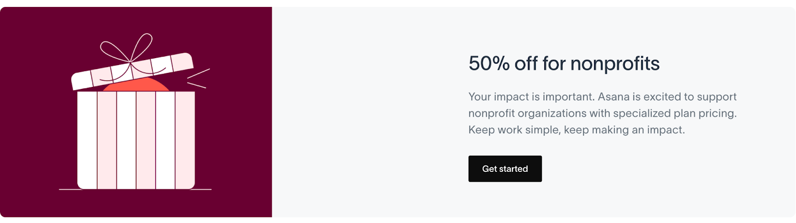
#4 Discounted Plans (Startups, NGOs)
If you sell to startups and nonprofits, you might offer a dedicated discounted plan for them.
Asana offers a 50% discount for NGOs.
#5 Chat Widget
If you decide to have a live chat embedded on your website, adding it to your pricing page makes sense, especially to ensure questions are answered and to escalate questions to a live support person.
Just make sure that if the chat widget is answering questions, it can do so reliably and accurately, and if you’re routing to another person, they are consistently available on short notice.
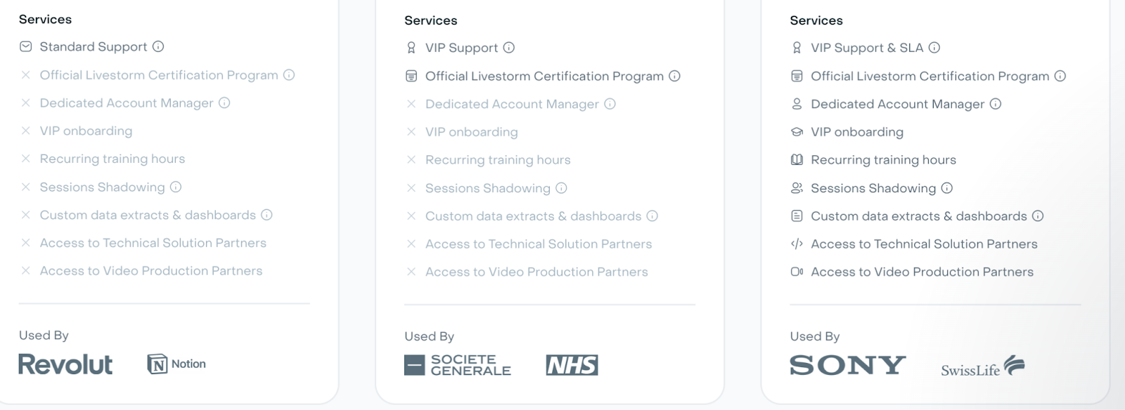
#6 Trust Signals Footer
This includes security badges, payment icons, support availability, and migration assistance if applicable. There’s likely redundancy with the FAQ section. Include these, especially if, like security badges, they’re a deal-breaker for prospective customers.
Miro has a ‘security and compliance’ section on their pricing page.

Conclusion
Building an effective pricing page doesn’t require innovation; it requires clarity.
The framework is straightforward:
Hero section that sets context
Pricing Menu that communicates essential information
Feature Comparison Table that removes ambiguity
FAQ that addresses lingering questions
If visitors can understand your pricing model and identify their fit within 30 seconds to a minute, you’ve done your job.
Resist the temptation to pack your pricing page with every detail, feature, and differentiator.
The best pricing pages respect the visitor’s time and intelligence. They present information in a familiar structure and highlight what truly matters.
Remember: your visitors have seen this before. They know what they’re looking for. Your job is simply to make it easy for them to find it.
Start with the basics outlined in this guide. Launch it. Gather feedback. Iterate. A simple, clear pricing page that helps visitors make confident decisions will always outperform a complicated one that tries to do too much.
Want us to review your pricing page?
👉 Reply to this email. We will share with you a Loom video giving you actionable feedback on how to improve your pricing page.
Happy growth 🚀
3 ways I can help you grow your SaaS to €1 million ARR 👇
1️⃣ Use my free GTM library with 50+ free resources (guides, templates, workbooks, and tools) to build a strong GTM foundation (helped 5000+ SaaS leaders)
2️⃣ Get a 360° GTM audit of your status quo + a custom 6-month action plan
3️⃣ Work 1-on-1 with me - GTM Advisory for SaaS founders from €0 to €1 million ARR
 | A guest post by
|
Nice breakdown. People expect pretty much exactly this these days
Insightful. What if the 'must-have' sections of a pricing page could dinamically adapt based on real-time user engagement or AI-driven behavioral predictions?