

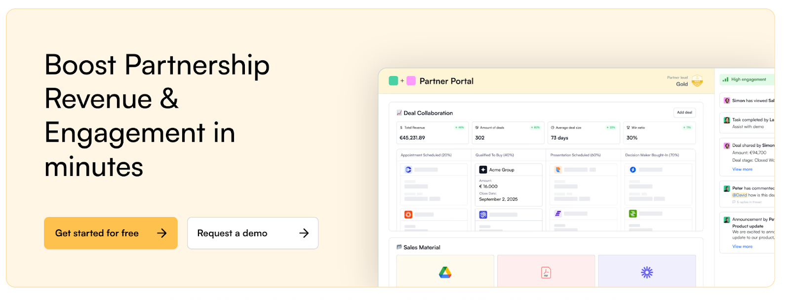
The perfect Product Pages for SaaS founders
Feature Pages, Use-case Pages & Customer-segment pages


Hey - it’s Alex, this time together with Toni Hopponen - the master of landing pages and founder of landingrabbit.com!
Today, we cover how you can build great product pages for your SaaS/AI - including a feature page template and 9+ actionable tactics you can apply in < 30 minutes.
Bonus Links
👉 Check out my GTM library with 50+ free resources (guides, templates, workbooks, and tools) that help you build a strong GTM foundation.
In case you missed the last 3 episodes:
✅ How to test your messaging to find message-market fit
✅ 14 actionable tactics for a better CRM
✅ 10 GTM tactics to generate pipeline in H2 2025
A quick word from our sponsors
📢 dofollow.com – Visibility that drives SaaS revenue

Your buyers search on Google and AI before they buy. If your site isn’t visible there, you’re losing pipeline. dofollow.com gets you featured on authority sites your buyers trust - so more prospects land on your site ready to convert.
→ Visibility that drives demos and signups
→ Features on sites like HubSpot, Monday
→ Guaranteed links + no lock-in contracts
📢 Playbookz – Done-for-you LinkedIn growth for CEOs & execs

Turn LinkedIn into your #1 growth channel without writing a single post. Playbookz builds high-converting content that’s landed clients 2M+ reach and 1,000+ qualified leads.
✅ Just 60 min/month of your time
✅ Proven results (20k+ views in 28 days or free)
✅ Exclusive: $1k off for newsletter readers
Want to reach 5000+ early-stage SaaS founders/leaders? Sponsor the next newsletter.
Note: This episode might be too long for your email client. Read the full episode on web.
What are product pages?
When you’re just starting, your product is usually focused. It does one or two jobs well.
And that’s exactly how it should be.
But as your product grows, so do its capabilities. It starts to solve more problems and cover more use cases.
That’s when your homepage alone is not enough anymore, and it makes sense to introduce product pages.
Product Pages vs. Homepage
When it comes to GTM assets, we talked a lot about the importance of your homepage.
Quick reminder, a good homepage should answer these 6 key questions for your visitors:
What is the product/service they offer?
What problem does it solve for me?
What can I do with the product?
Who is it for? Is this product for me?
What are the main benefits for me?
Can I trust the company?
I recommend that your homepage come with the following sections:
(Sticky) Navigation bar
Hero Section
Social Proof
Before X (Problem / Status Quo)
Intro Solution
Capabilities Section
Special Purpose Sections
Main CTA

But your homepage is
❌ NOT a detailed page about how your product works.
❌ NOT a page purely on 1 specific use case or 1 specific feature.
Instead,
✅ That’s the job of product pages.
You usually find these pages sitting in the nav bar under ‘product’ or ‘solutions’.
As your SaaS grows, your homepage must serve visitors with diverse intents.
Someone might have heard about you in a podcast and might not have many expectations.
✅ In this case, an overview of the product can be enough to keep the visitor engaged and make them revisit another time.
✅ Other visitors might be looking for particular capabilities your product delivers. Your homepage is unlikely to answer everyone’s questions fully.
That’s where product pages come in.
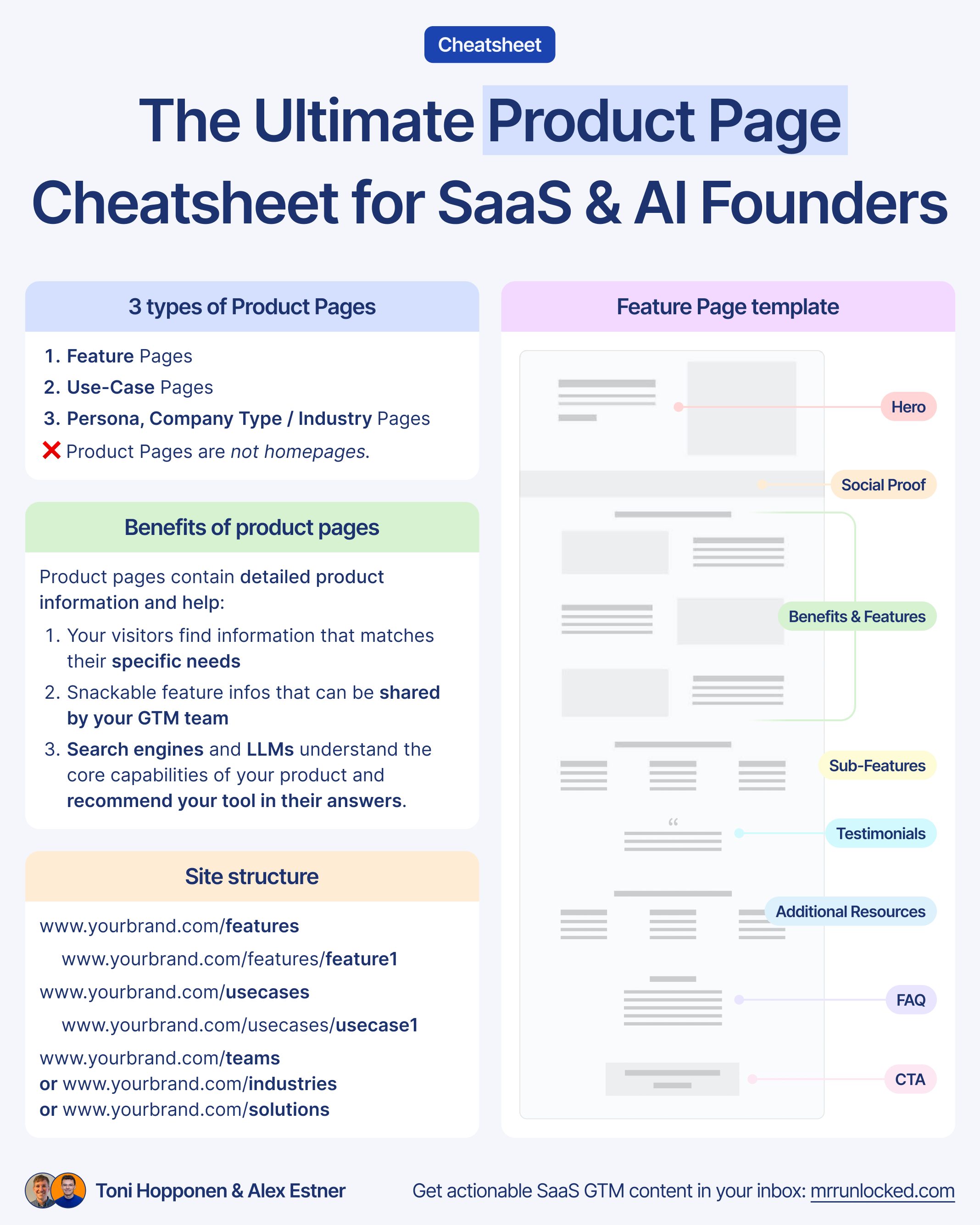
Benefits of product pages
Product pages serve multiple purposes and help:
1️⃣ Homepage visitors find information that matches their specific needs quickly
2️⃣ Sales and support teams share more information about a specific feature in a snackable format
3️⃣ Search engines and LLMs understand the core capabilities of your product and recommend your tool in their answers.
Site Structure of product pages
In terms of site structure, we see the following best practices:
www.yourbrand.com/features
www.yourbrand.com/features/feature1
www.yourbrand.com/features/feature2
www.yourbrand.com/usecases
www.yourbrand.com/usecases/usecase1
www.yourbrand.com/usecases/usecase1
www.yourbrand.com/teams or www.yourbrand.com/industries or www.yourbrand.com/solutions/persona1
3 types of product pages
In SaaS, you see mainly 3 different types of pages that contain more detailed product information.
1️⃣ Feature pages
2️⃣ Use-case pages
3️⃣ Customer segment pages (Persona/Teams, Company type, Industry pages)
Each of these pages has a slightly different focus.
✅ Feature pages and Use-case pages focus on ‘how it works’.
✅ Persona/Teams, company type, and industry pages focus on ‘Who it’s for and how this type of audience benefits from using the product’.
As your SaaS grows, feature pages become essential for helping different types of visitors, curious first-timers, detail-seekers, and decision-makers, find what they need beyond the homepage.
Feature pages
No surprise, feature pages are around a specific feature of your product.
The best Feature page structure
Not so surprisingly, there isn’t one perfect feature page template.

But at the same time, it doesn’t make sense to reinvent the wheel.
What matters is the story you tell to your audience. Getting your landing page structure right is more important than the exact words.
When your structure is right, the story is easy for your visitors to follow.
Toni, the co-author of today’s episode and founder of LandingRabbit, a SaaS landing page builder, has analysed hundreds of feature pages from leading SaaS companies, and the most common structure looks like this:
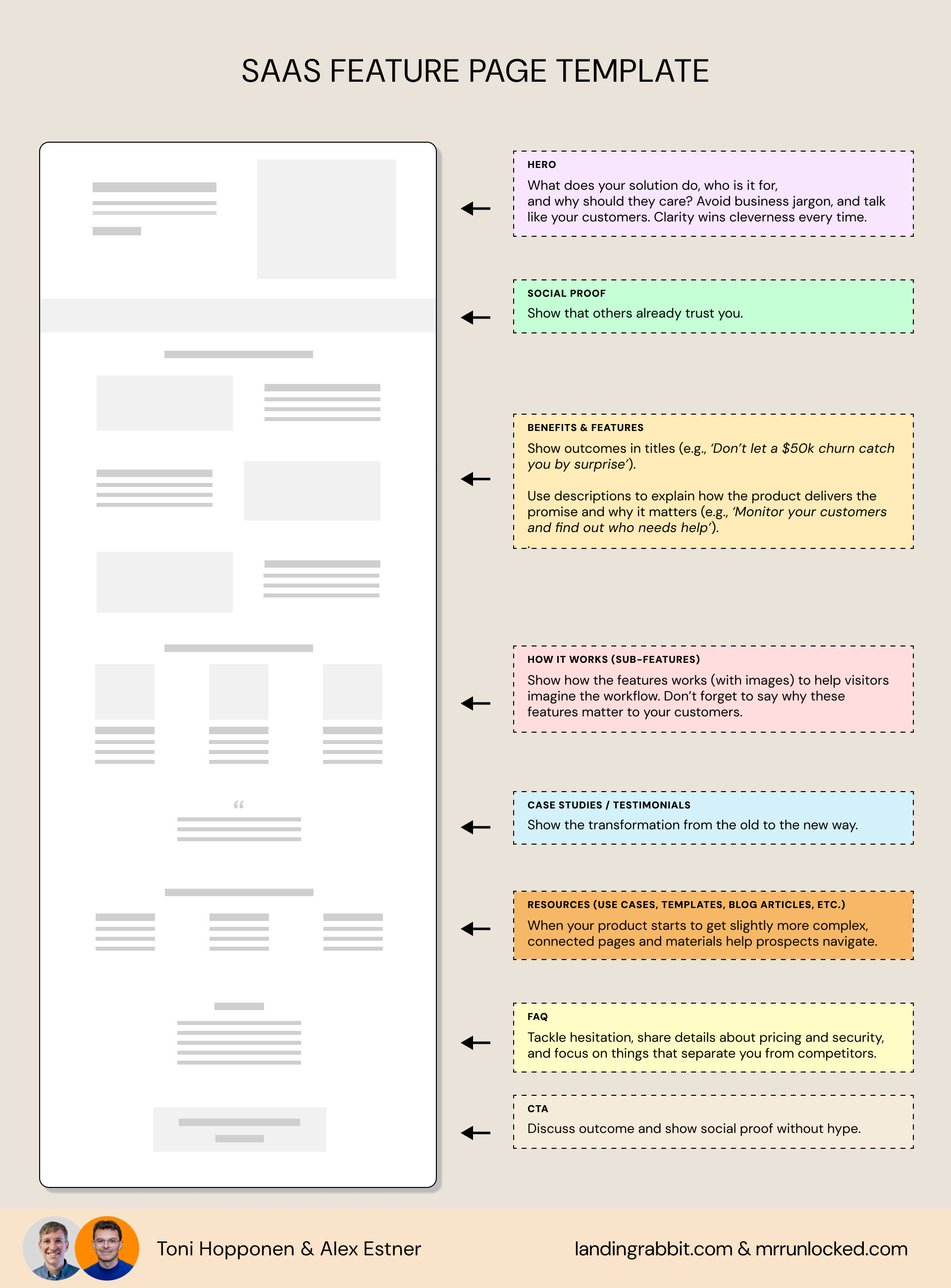
A high-performing SaaS feature page template includes:
Hero
Social proof
Benefits & Features
How it works (Sub-Features)
Case studies / Testimonials
Additional Resources (relevant use cases, templates, blog articles)
FAQ
CTA
SaaS feature page examples
Now, let’s take a look at the most common feature page elements through examples.
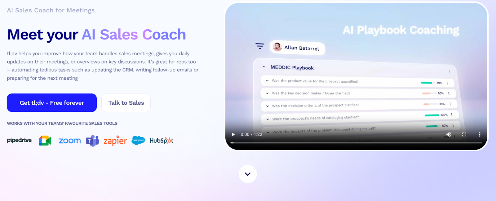
Hero
On a SaaS website, the hero often determines whether visitors keep scrolling or bounce.
A good hero section covers:
Explanation of what the product is, who it’s for, and what it helps them do.
A CTA button that invites action (usually a primary and secondary CTA)
Visuals that back up the message without adding noise.
for this, it includes:
Headline (H1)
Subheadline or description
Primary and secondary CTAs
Visual element: Product image/animation/video
Objection-handlers and Trust Elements
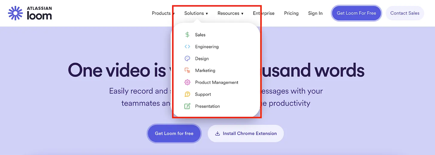
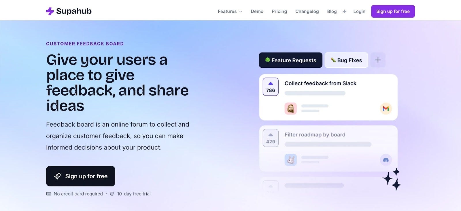
Supahub’s feedback board feature page gets it right.
Social proof
Social proof helps people trust your product.
The simplest way to add social proof is to show logos just below the hero.
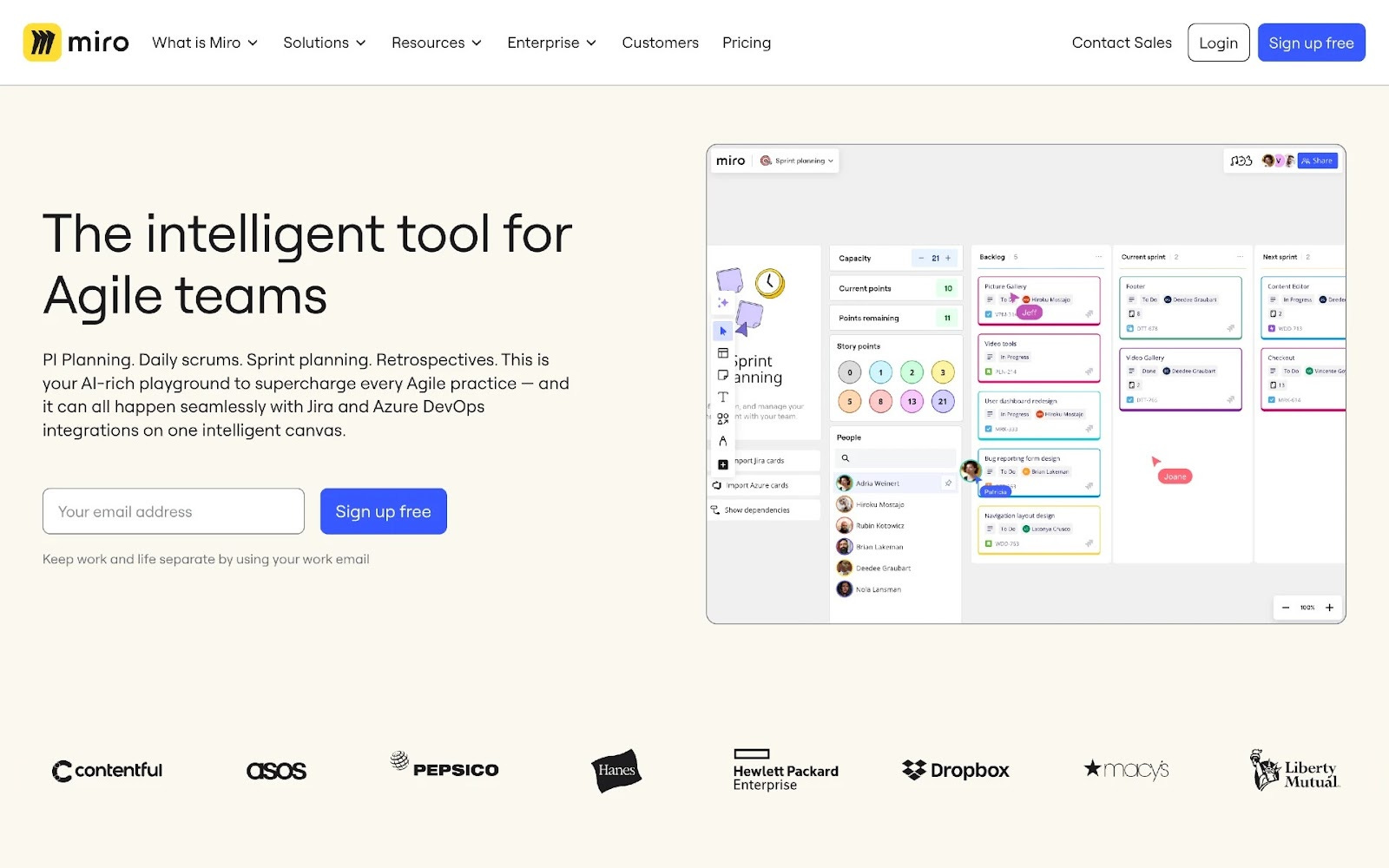
Miro’s feature pages are a great example. The logos are all black and consistently sized, keeping the section clean and making the branding feel more intentional.
A great tactic that becomes more and more common is to add case studies to the logo carousel. Clay was the first company to do this.

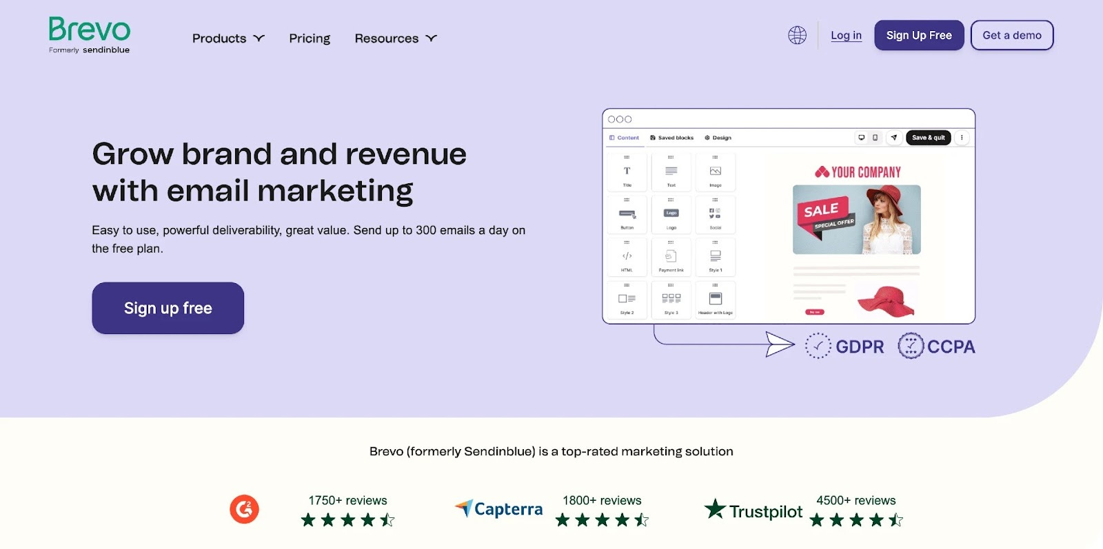
If you serve customers from SMEs to enterprises, choosing logos can be tricky. Showing usage stats and review scores like Brevo is a great alternative.
Benefits & Features
There is a lot of discussion on whether to talk more about features or only benefits.
We strongly believe it’s always both.
❌Only talking about your features without explaining why it matters and what results I can expect, only works for visitors who are already deep into research mode (on which tool to use).
❌ Only talking about benefits and results is not enough information for someone who really cares about how the product works.
✅ So, best, combine both.
Example: Puck’s page on Job descriptions does this well. The copy leads with the benefit, 'say hello to your new teammates', and the image backs it up by showing how the product delivers on that promise.

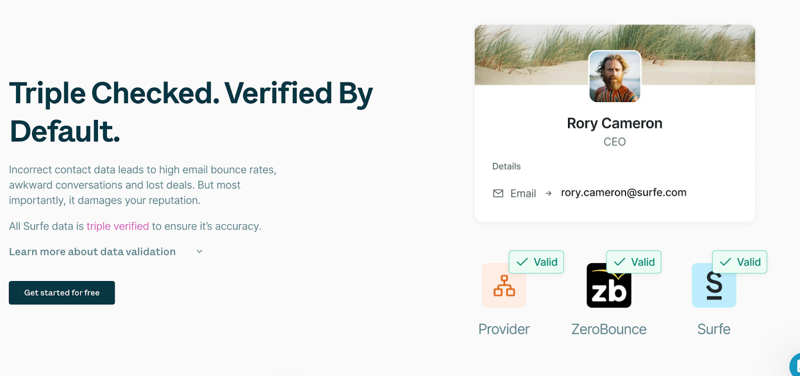
On Surfe’s waterfall data enrichment feature page, they talk about the ‘tripe checked’ but also about the benefit of it (lower bounce rate, fewer lost deals…).
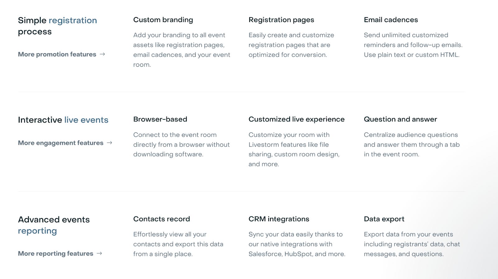
How it works (Sub-Features)
If you're in a crowded market, your visitors need to know more specifics about your product.
They want to know the details:
“Do you also offer integrations to X?”
“How exactly does this feature work?”
“Do you offer localization for my CMS?”
That’s why many SaaS landing pages lean heavily on feature lists.
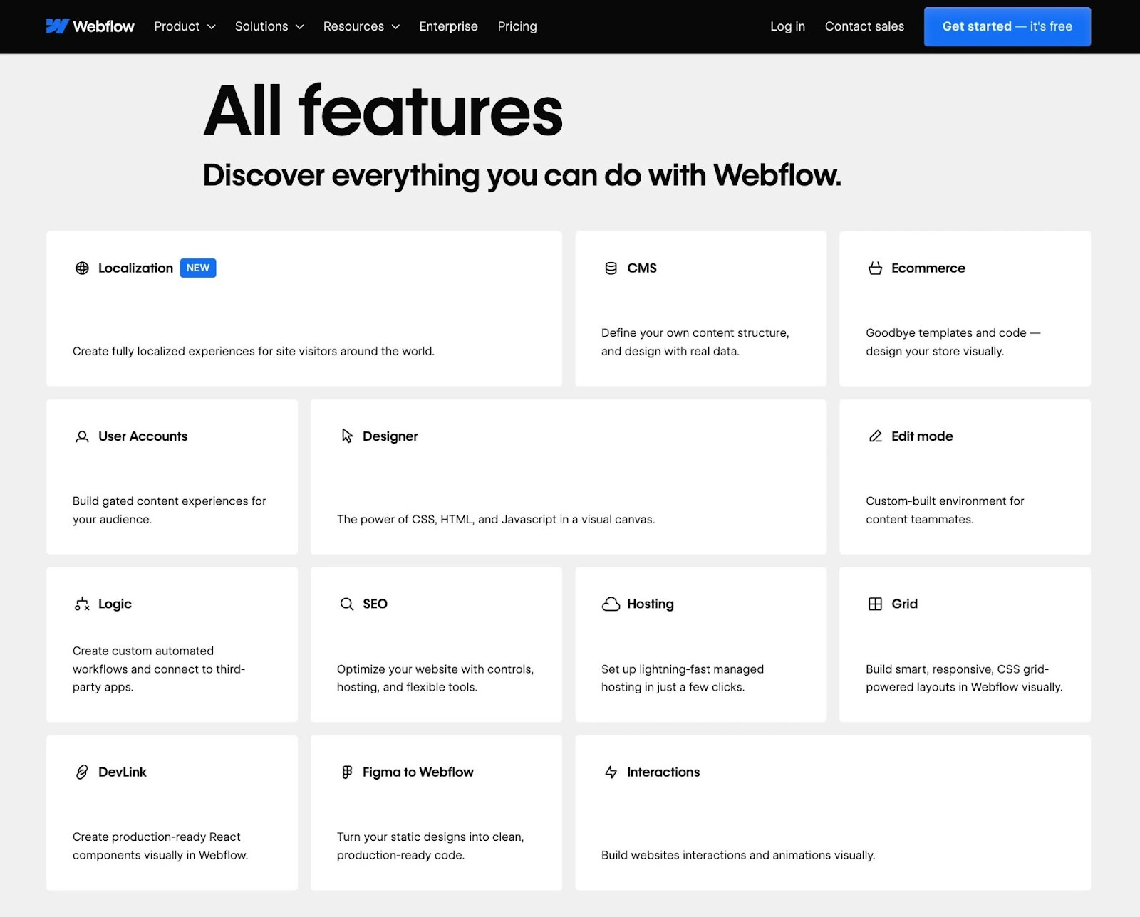
Take Webflow’s SEO feature page. It doesn’t just talk about SEO tools. It gives the full picture, showing how SEO is connected with the rest of the solution.
Or Beehiiv’s newsletter editor feature page. The talk about the sub-features of the editor feature.

But, feature walls are not the only way to add ‘how it works’ information.
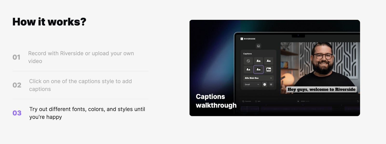
You can also guide the visitors with a ‘how it works’ section.
Take the example of Riverside’s Caption feature page.
Case studies / Testimonials
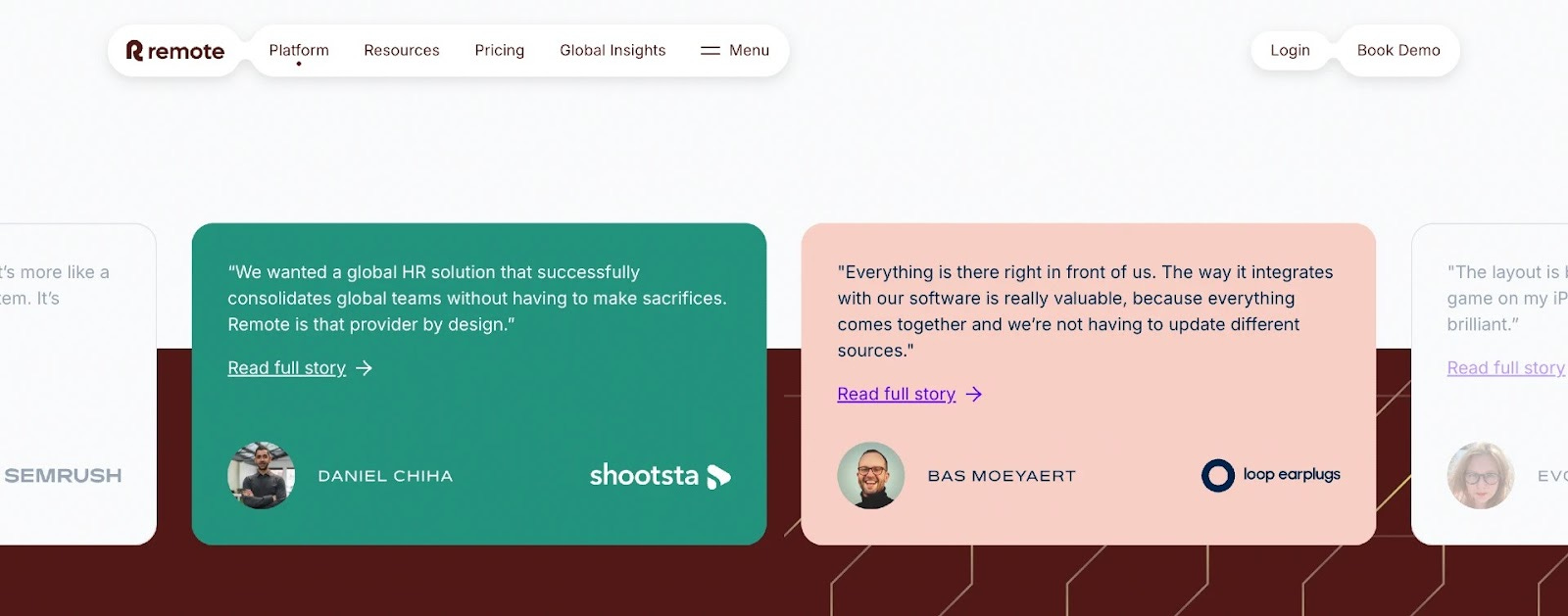
Case studies further down the page are another great way to create urgency and build FOMO.
They also make it easier for your champion to bring others on board, especially the decision-makers who won’t use your product but control the budget.
Remote’s HR software page does this well. The section includes a real customer quote and links to a full case study. Simple, credible, and easy to share.
Additional Resources (relevant use cases, templates, blog articles, or more features)
Do you have more content that is specifically for this feature?
Then it might be a good idea to add them to your ‘additional resource’ section.
This could include:
✅ Templates for this feature
✅ Blog articles about this feature
✅ Use cases that are powered by this feature
Or simply guiding the user to other relevant features that your product offers.
Let’s have a look at some examples.
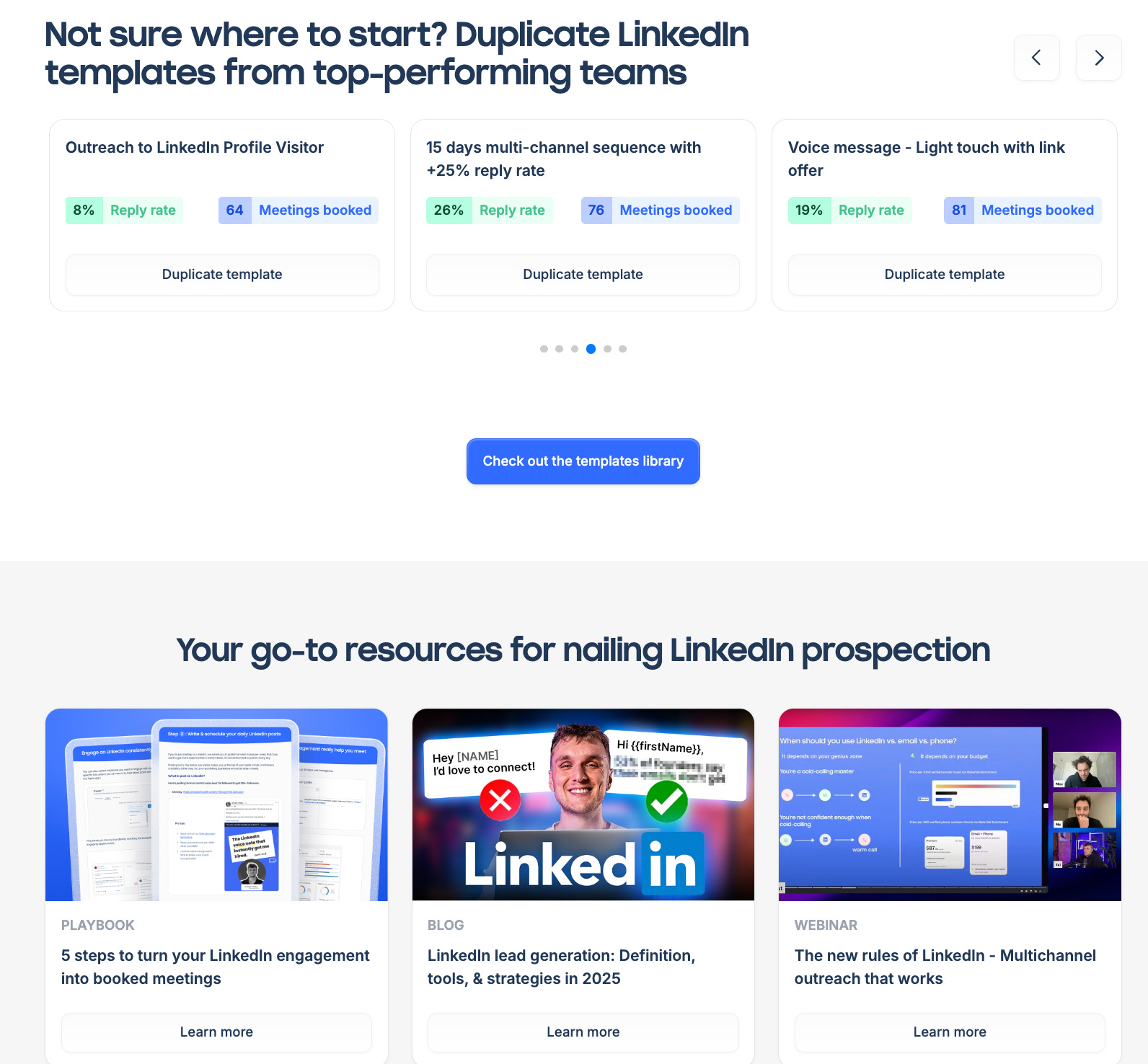
Lemlist adds additional resources that fit that specific feature.
They add LinkedIn templates and blog articles around that topic on the ‘LinkedIn prospecting’ feature page.
Homerun’s job application tracking page and Asora are good examples of highlighting other relevant features/products.
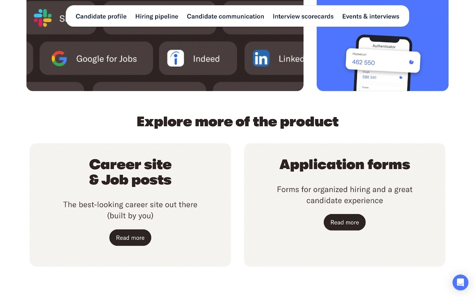
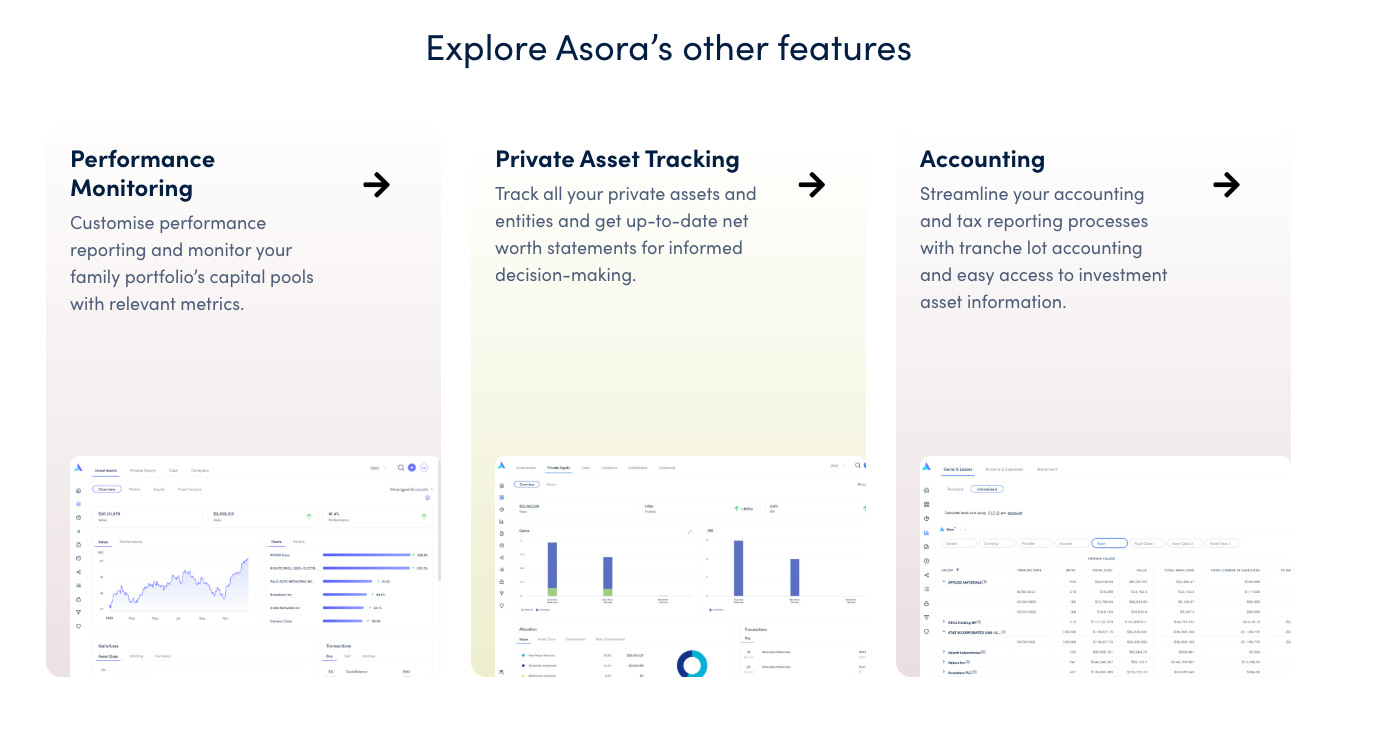
This makes it easy for visitors to explore what else they might need.
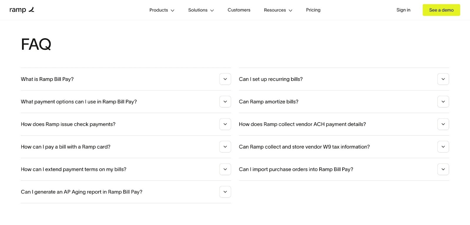
FAQ
Talk to a few customers in support chats and emails, and you’ll start to notice the same questions repeatedly appearing.
A well-placed FAQ section at the end of your page is super useful.
✅ You can repeat things you already said above, and share more details.
✅ Pro-actively address common objections (e.g. Can I test the product for free?)
✅ Easy to digest Q&A style info (great for LLMs to learn about your product)
Ramp’s page is a great example. Their FAQ covers key concerns clearly, right where you’d expect to find them.
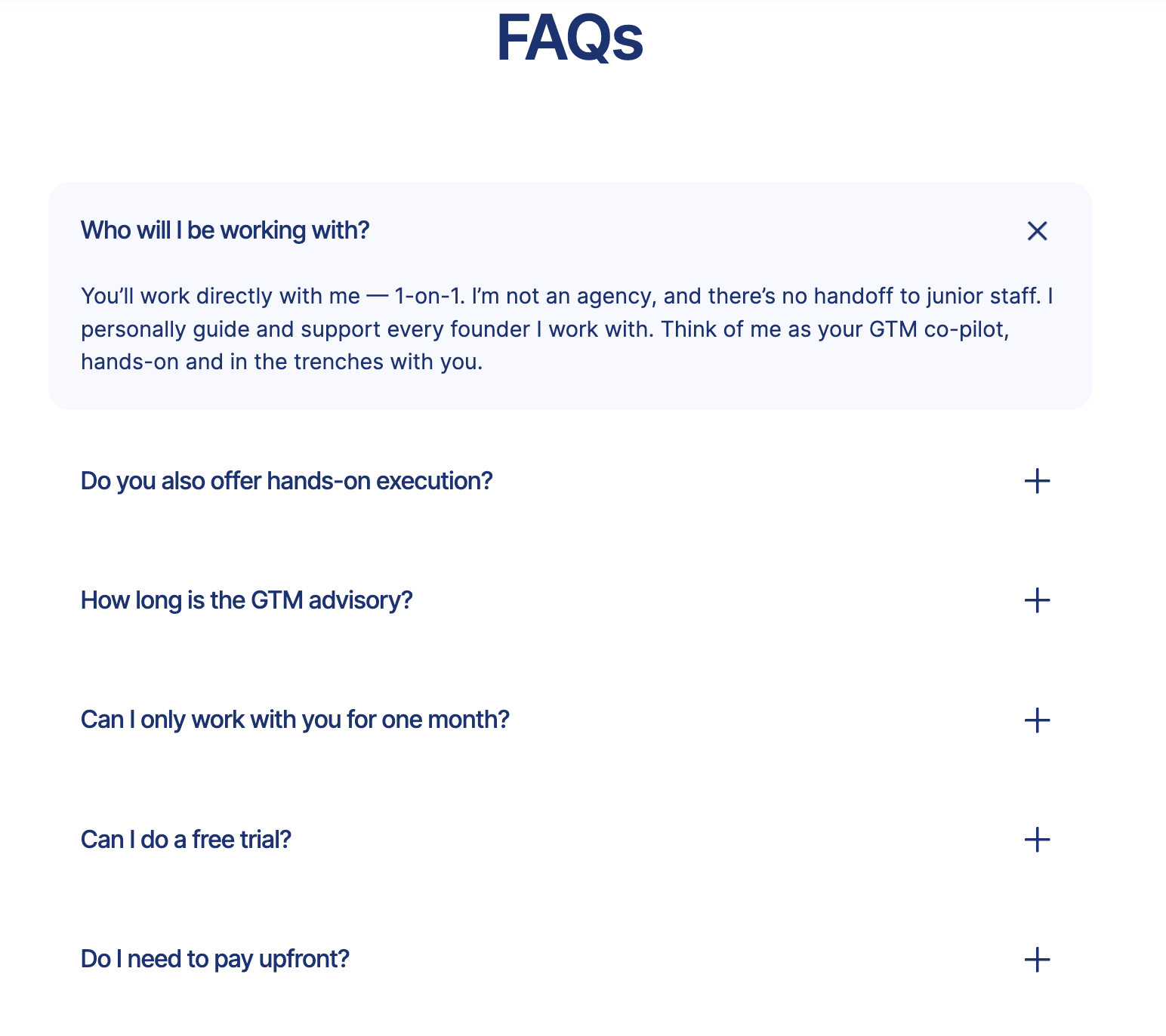
I’ve also added the most common questions about my 1-on-1 GTM advisory in the FAQs.
CTA
The CTA at the end of your product page is super important.
This is where SaaS copywriting counts.
Retool’s feature page does this well. Their core message is speed: you can build internal tools fast. That’s why their final CTA line ends with 'in under 10 minutes'. It’s a simple, specific promise.
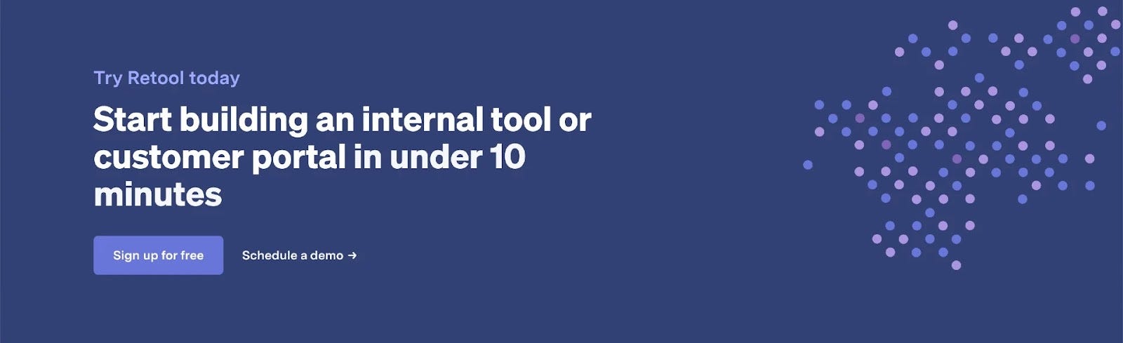
Another great design tip is to:
✅ Create a different coloured box for your main CTA at the end
✅ Add a product visual again
Introw does this well.
Use Case Pages
While feature pages focus on describing how a specific feature works, use case pages usually describe how users can use their product for different ‘purposes’.
Meaning you drill down the information to the relevant:
✅ Features (how these features enable running the use case)
✅ Target audiences (how they can perform the use case)
Here are some good tactics on how to run use case pages.
Tactic 1: Publish a ‘use cases overview page’
When your product can be used for multiple different use cases, launch a pillar page with an overview of them.
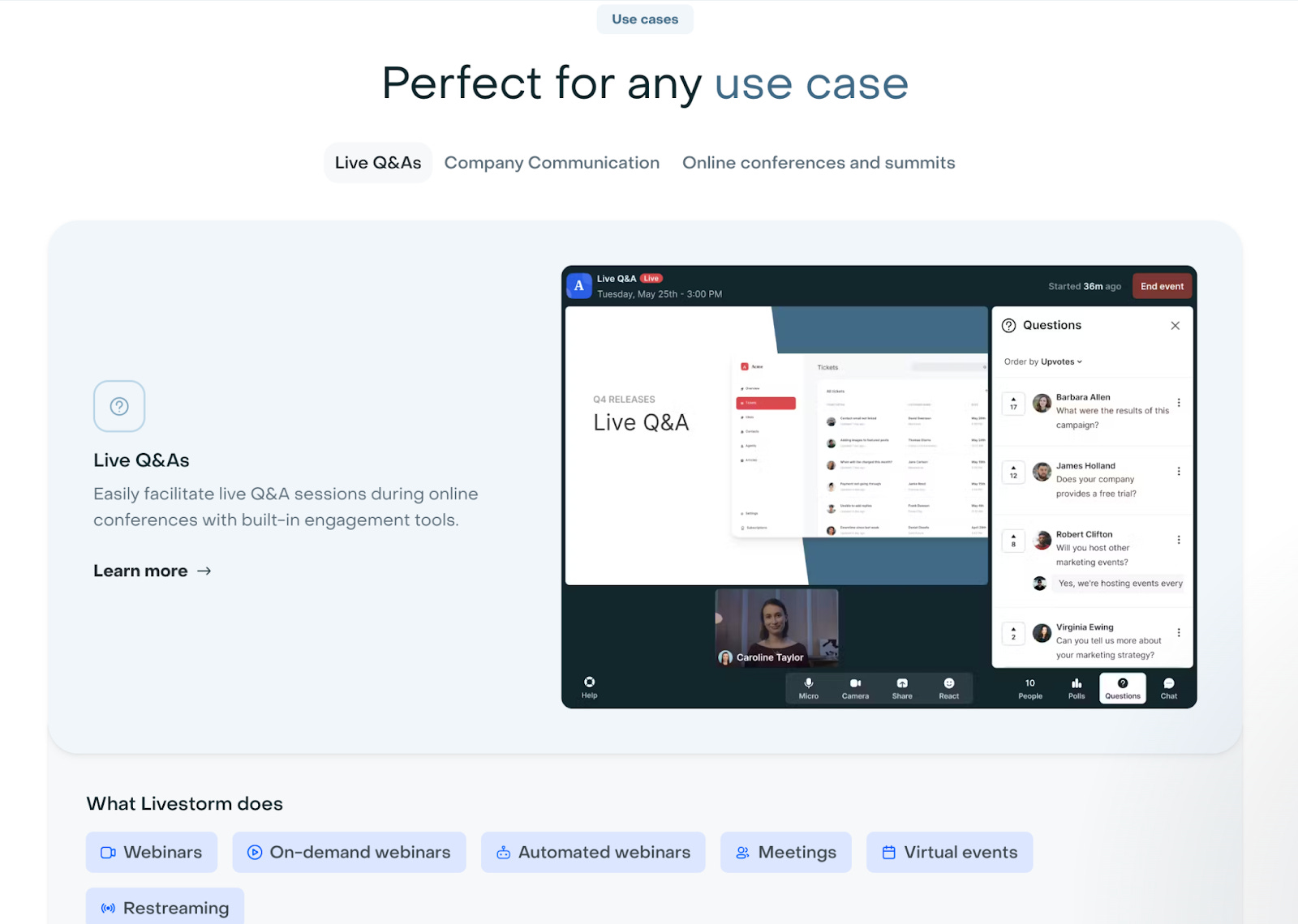
A great example is Livestorm, a webinar software, can be used for different use cases, including product demos, online conferences, company communication, podcast interviews, and much more
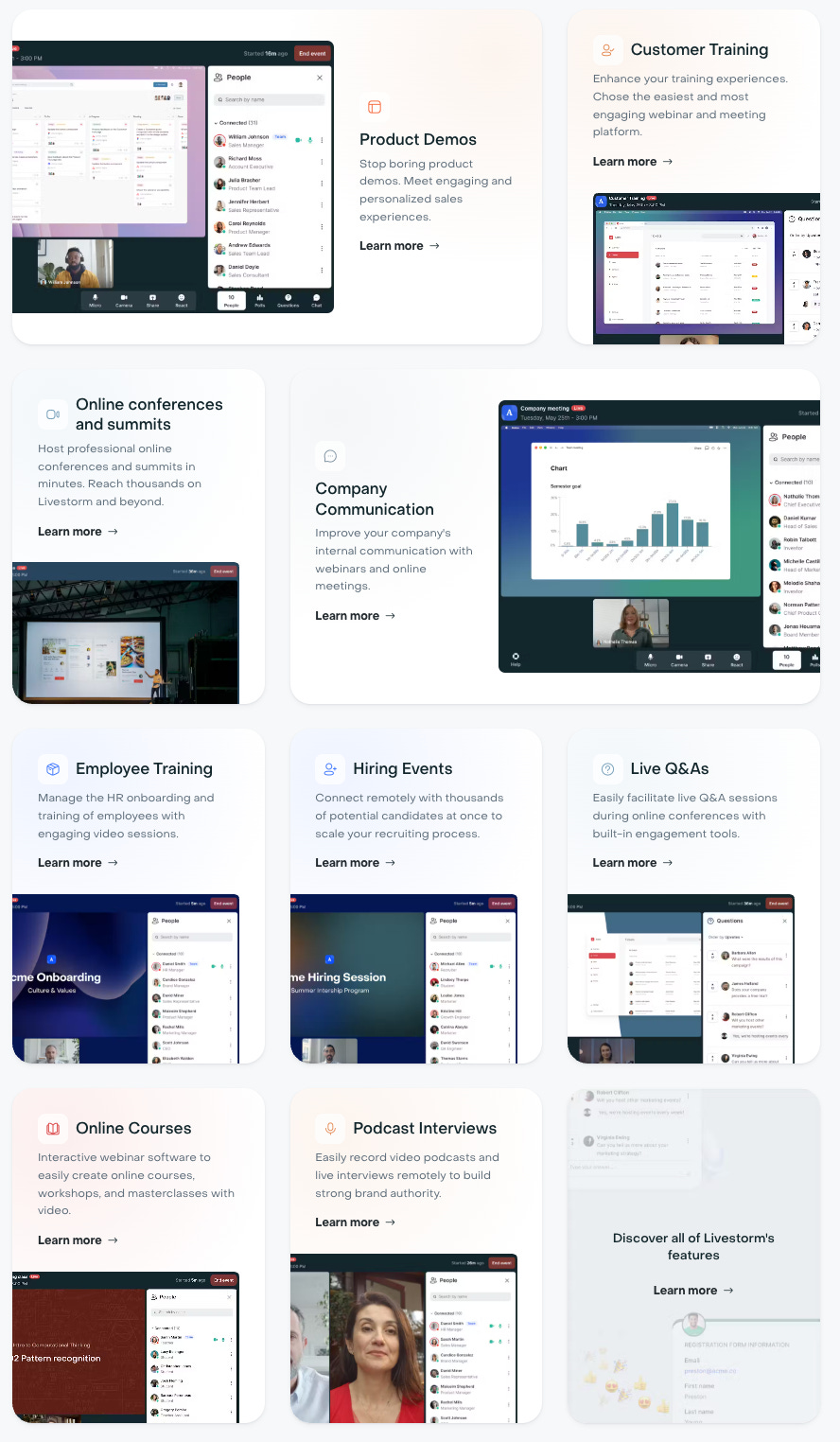
Tactic 2: Add a section on how specific features power this use case
I like how Livestorm adds a dedicated section on their ‘live event’ use case page that drills down on how you can use their product to host online events.
Tactic 3: Customize social proof for this specific use case
And again, they customize their social proof to that specific use case.

Customer-segment pages (Persona/Teams, Company type, Industry pages)
These ‘target audience’ specific pages usually contain specific information on how this target audience is using the product.
Meaning you filter the relevant:
✅ Features
✅ Use cases
for this audience. So they feel this product is specifically made for them.
Depending on your market and type of SaaS (vertical vs. horizontal SaaS) you’re building, it might make sense to build specific pages for:
✅ different Teams (Yourproduct for marketing, Yourproduct for sales…)
✅ different Personas (Yourproduct for designers, Yourproduct for SDRs…)
✅ different Company Types (Yourproduct for Hairdressers, Yourproduct for Massage Salons…)
✅ different Industry (Yourproduct for Healthcare, Yourproduct for Tech Companies…)
Here are some good tactics on how to do this.
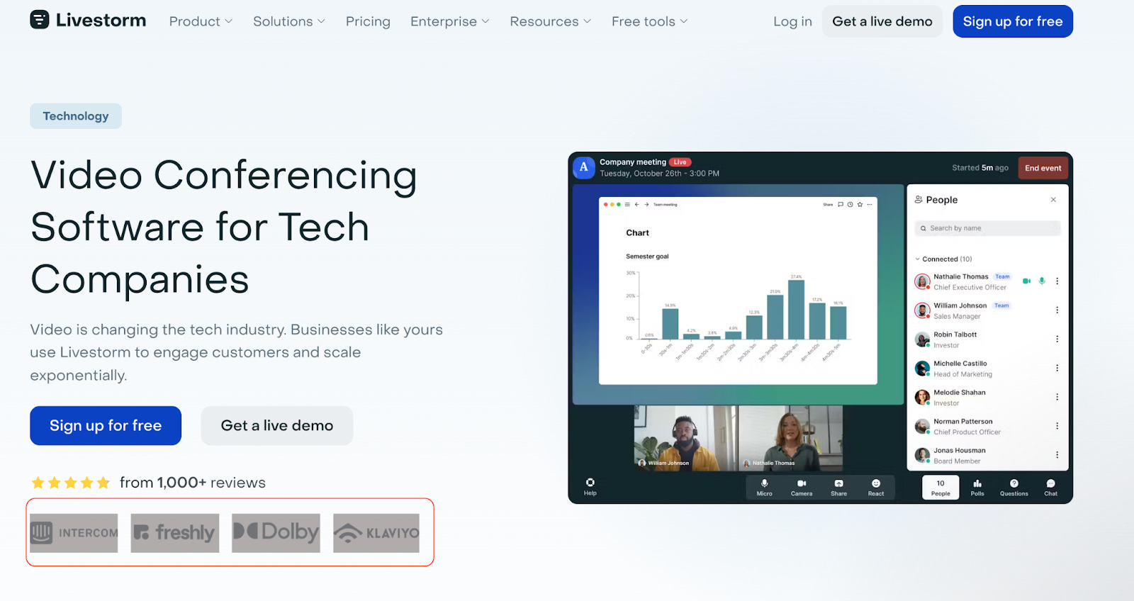
Tactic 1: Add ‘company type/industry’ in the H1
Example: livestorm.co/industries/saas

Example: tldv.io/teams/sales/sales-managers/
Tactic 2: Choose industry-relevant logos
Tactic 3: Add a ‘relevant use cases’ section
On your Persona, Company type / Industry pages, you add a section where you highlight the relevant use cases for this target audience.
Tactic 4: Add a ‘relevant features’ section
Call out the features that the target customers care about.
Tactic 5: Add target customer-specific case studies/social proof
Instead of adding any social proof, add the case studies/testimonials from that specific target customer type.
Tactic 6: Before/after section specifically for this target customer type
Okay…that’s it for today.
Now you know how to add strong product pages to your SaaS.
Happy growth 🚀
3 ways I can help you grow your SaaS to €1 million ARR 👇
1️⃣ Use my free GTM library with 50+ free resources (guides, templates, workbooks, and tools) to build a strong GTM foundation (helped 5000+ SaaS leaders)
2️⃣ Get a 360° GTM audit of your status quo + a custom 6-month action plan
3️⃣ Work 1-on-1 with me - GTM Advisory for SaaS founders from €0 to €1 million ARR
 | A guest post by
|